Generalized Hyperbolic Stretch (GHS) Transformations
After integrating your data, stretching is essential to raise your image from the darkness and apply the contrast needed to reveal details. While Siril has simpler stretching tools, GHS provides the greatest freedom to reveal and highlight exactly what you want to communicate in any astronomical image.
How the GHS Parameters (sliders) change the Image and its Histogram #
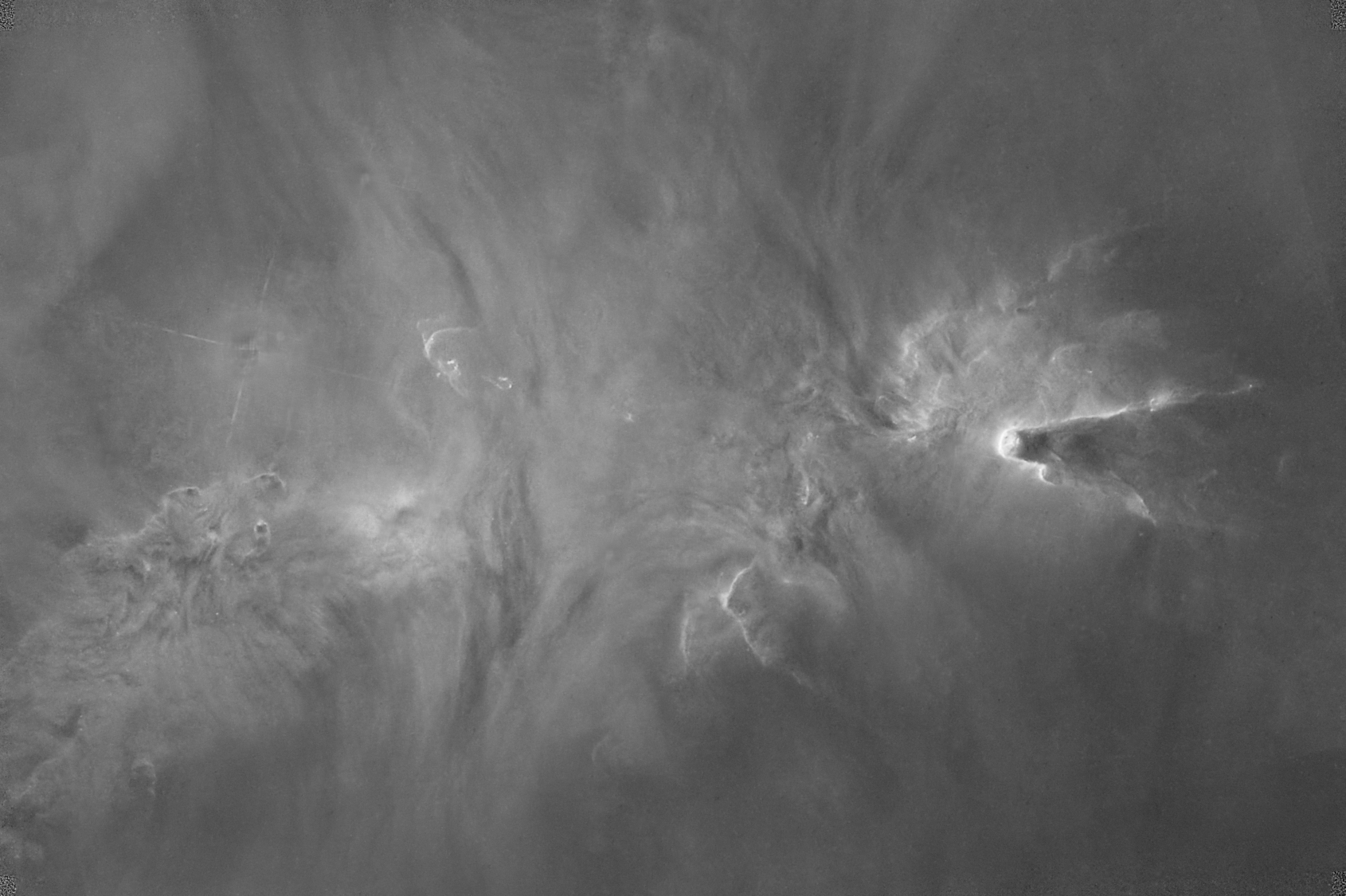
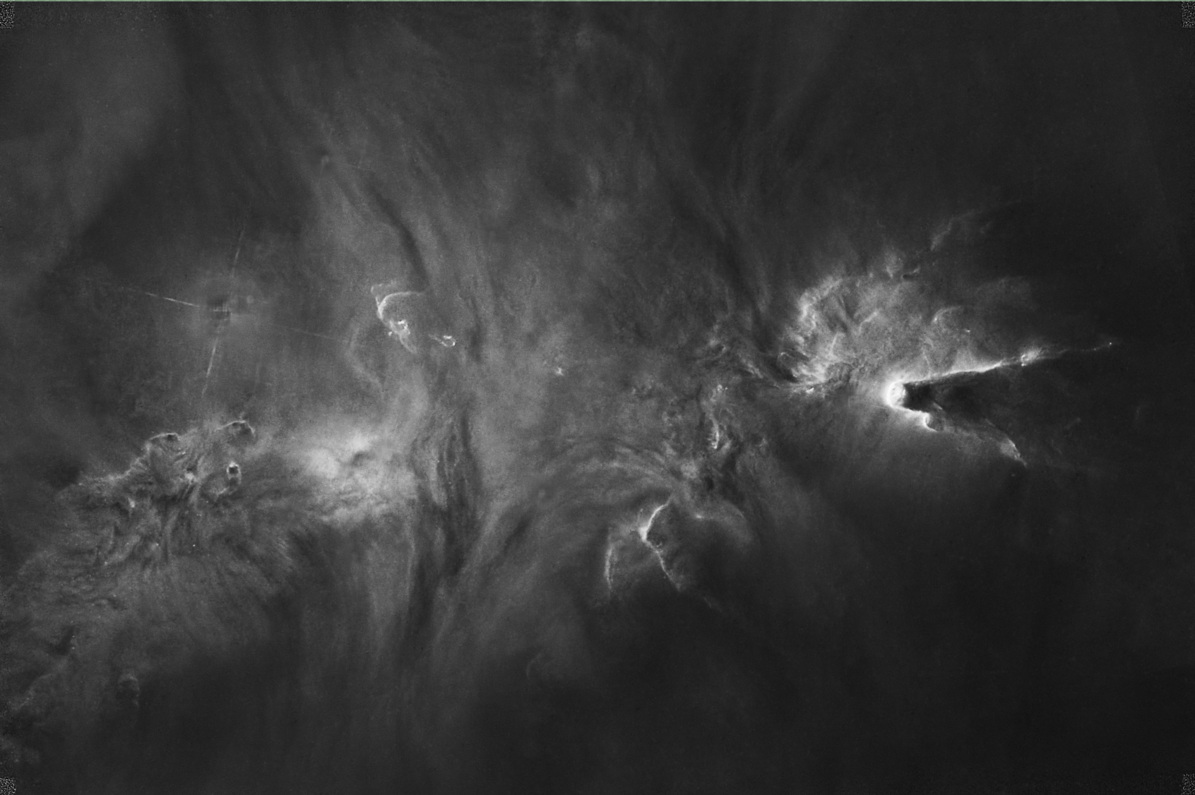
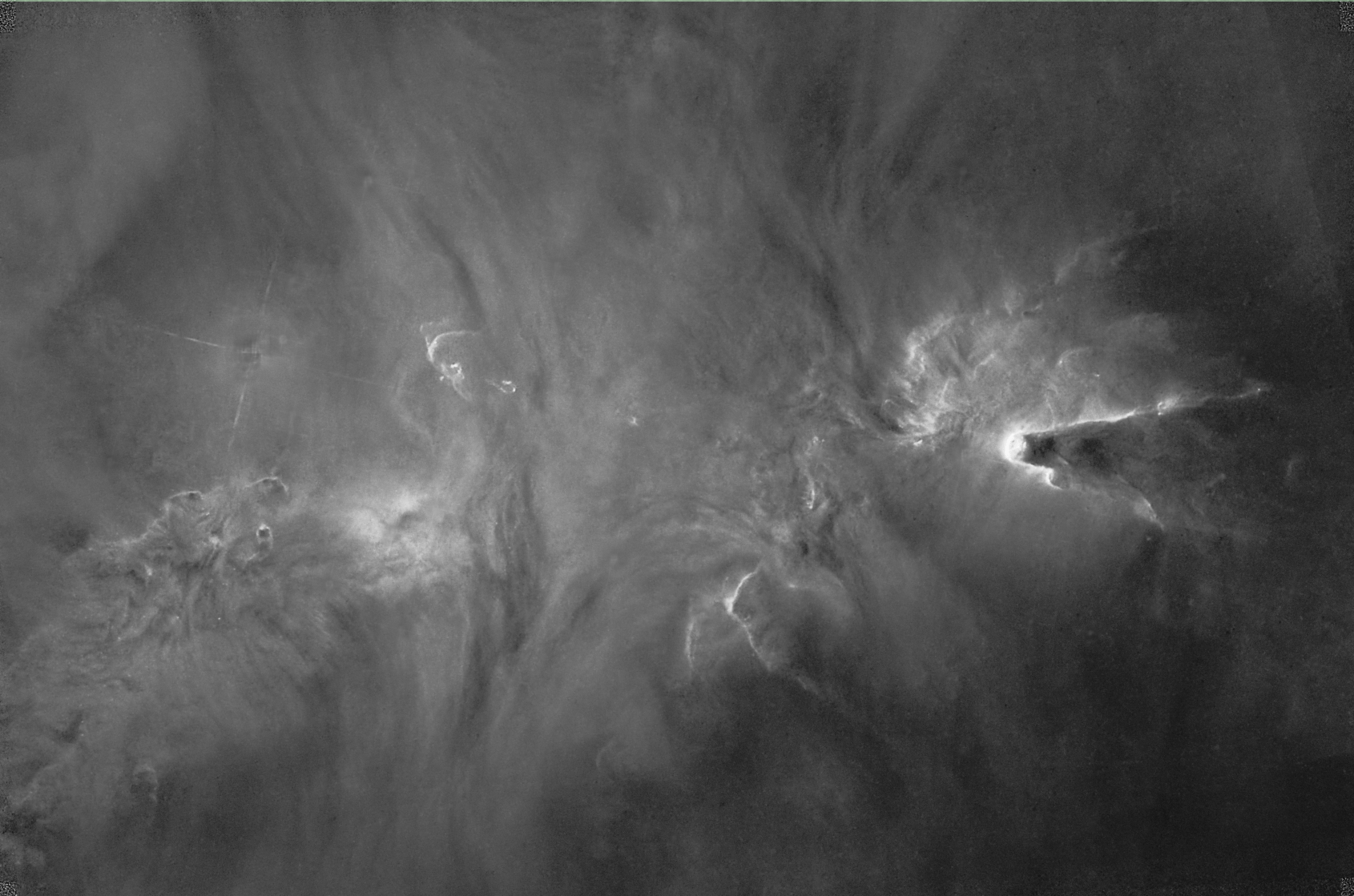
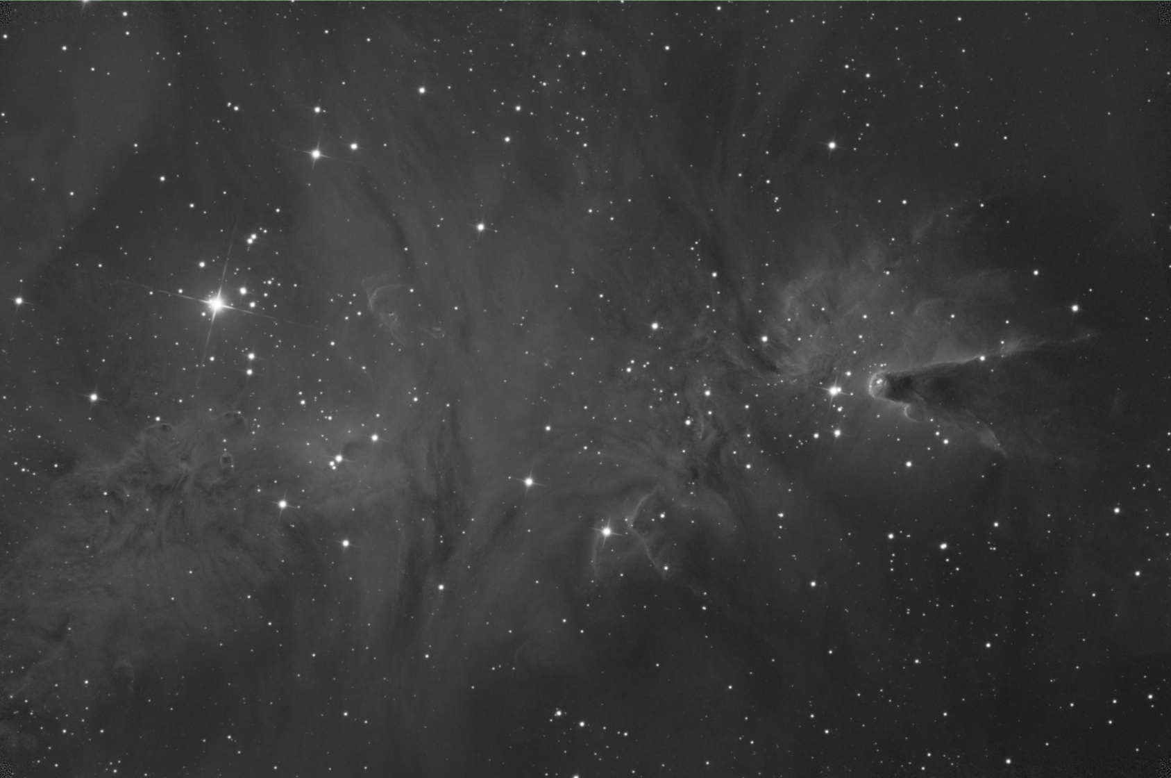
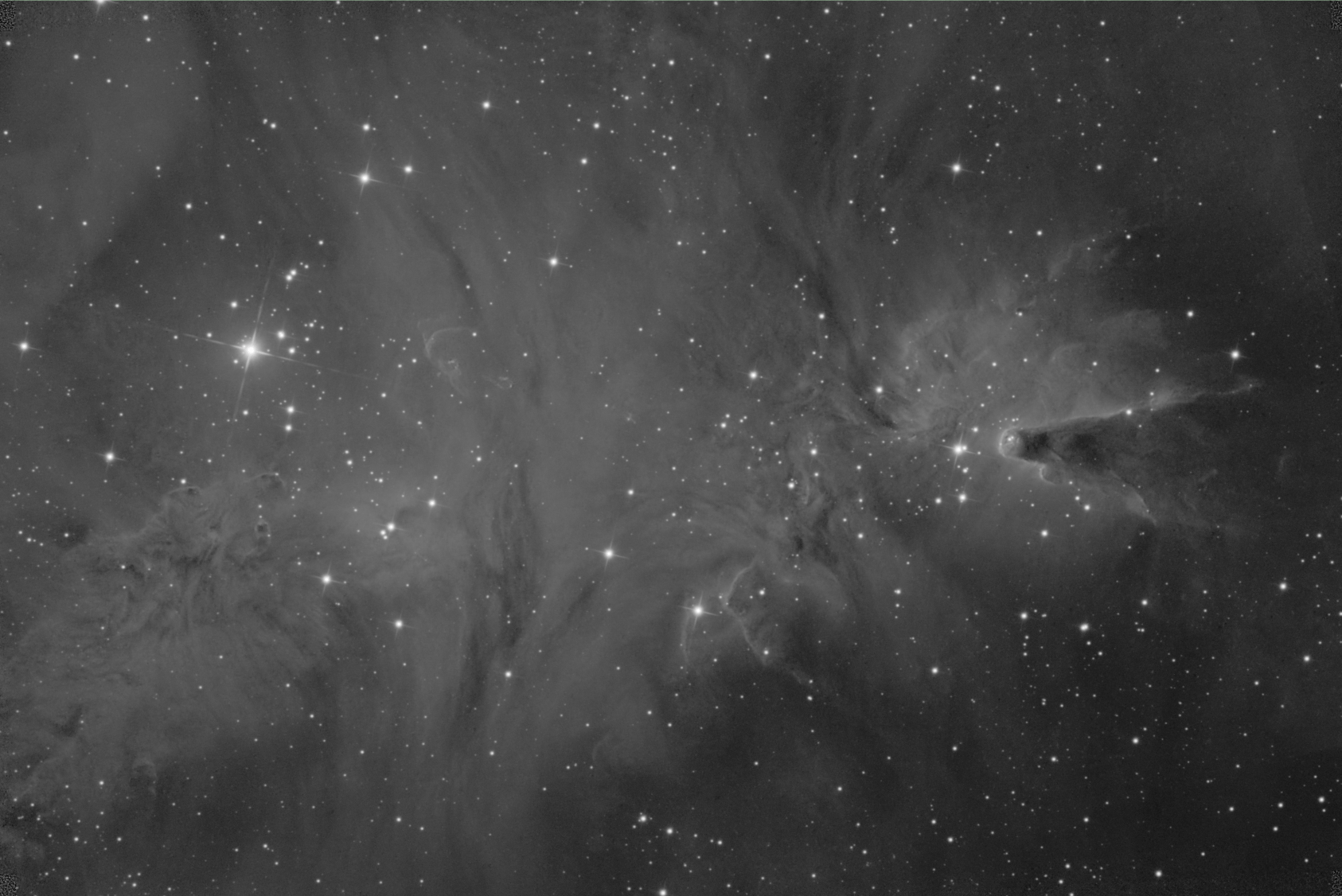
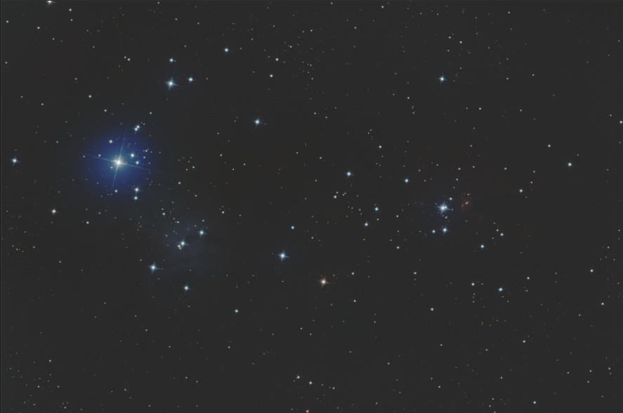
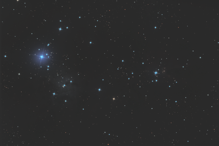
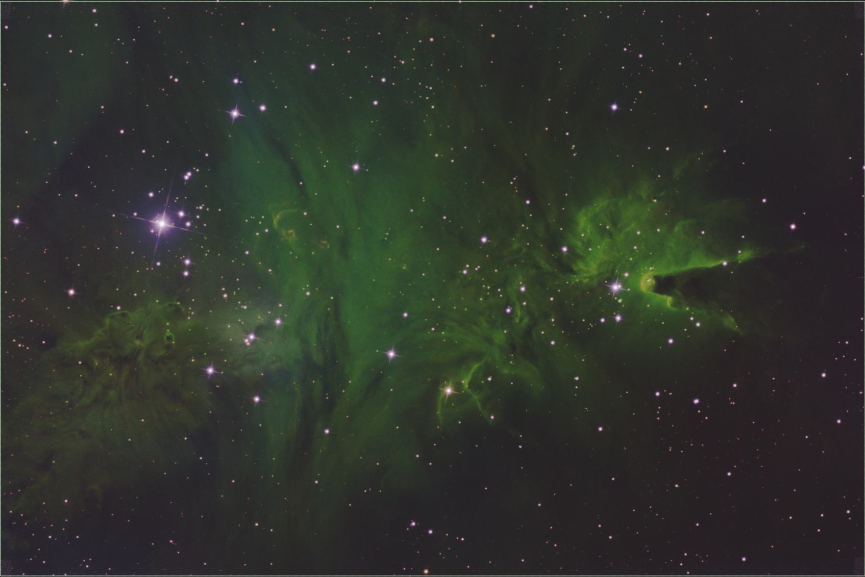
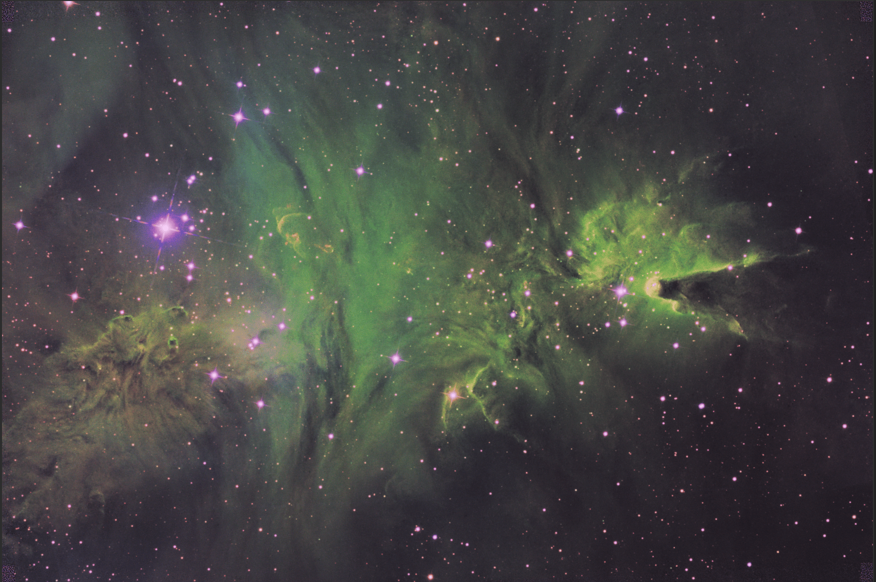
The understanding comes most easily if you follow along by loading up an image you have completed yourself, or any already stretched image that you can read into Siril. It doesn’t have to be monochrome, but it does make it easier to follow the histogram changes. It doesn’t have to be starless or even an astronomical image - but it should contain at least some mid-level brightness. Here is my image, which represents a processed luminance channel from NGC2264 - the Christmas Tree Cluster (except, of course, without the star cluster itself).

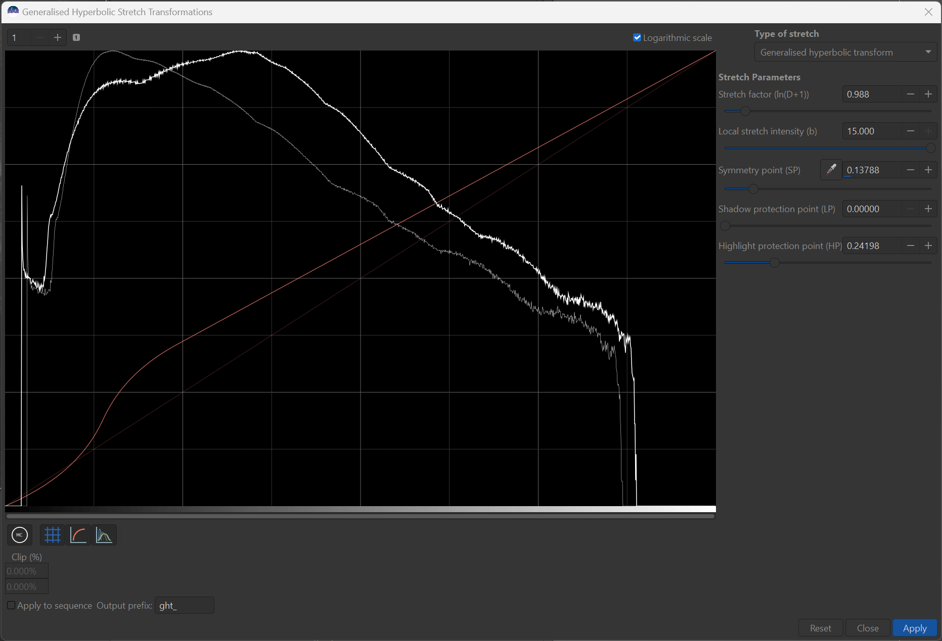
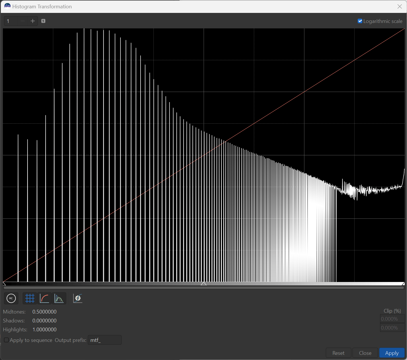
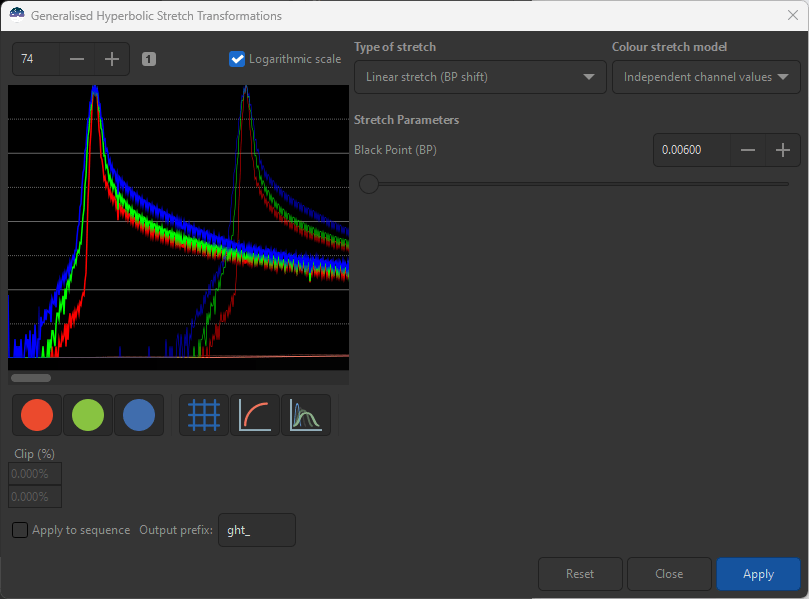
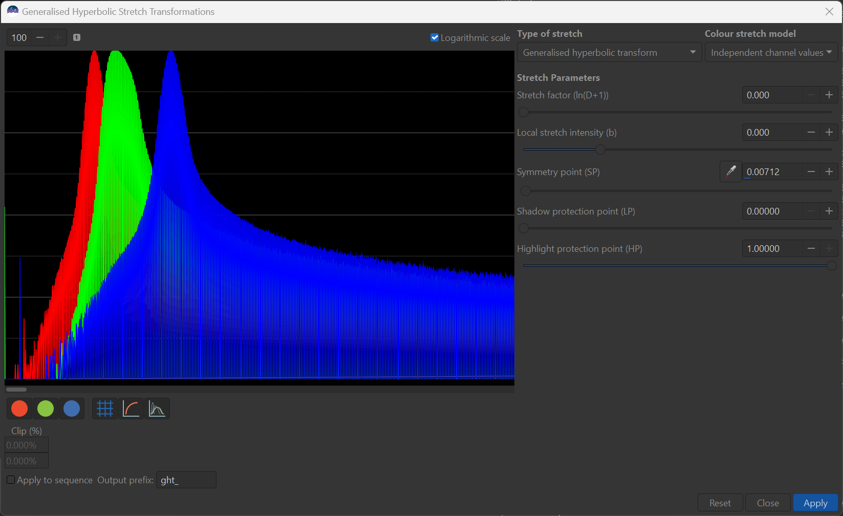
Once your image is loaded, go ahead and select Image Processing -> Generalized Hyperbolic Stretch Transforms from the pull down menu and Siril will display the histogram associated with the image along with the GHS controls on the right hand side (RHS):
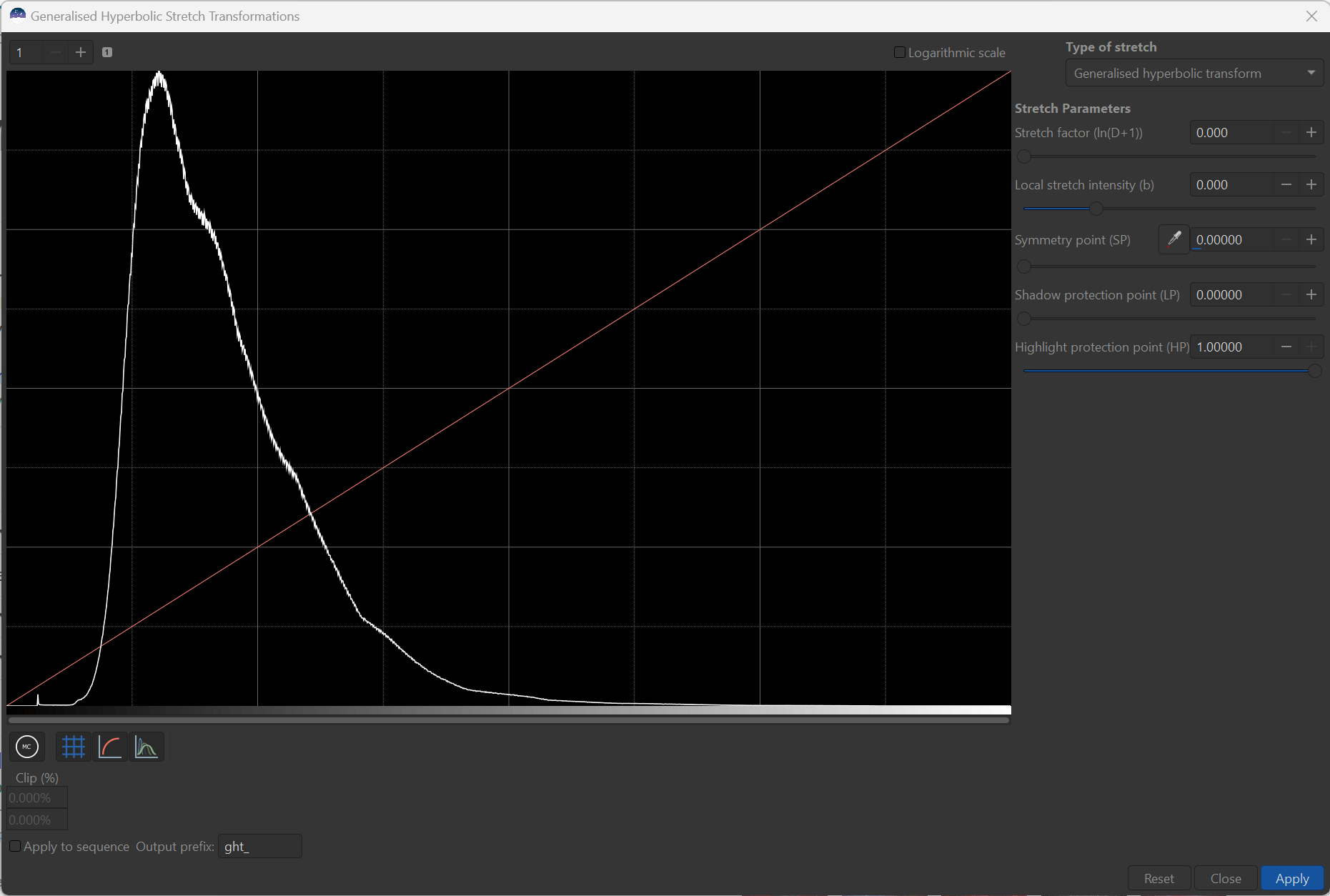
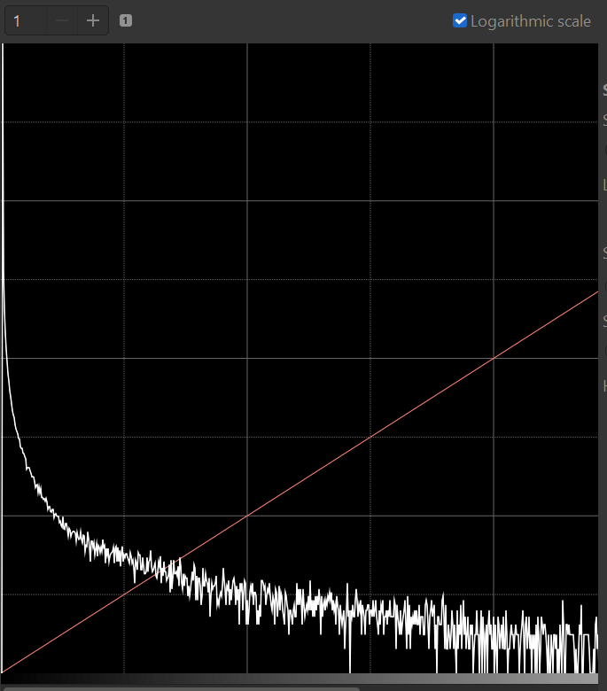
What the histogram shows is the distribution of pixel brightness throughout the image, with the darkest pixels on the left and the brightest on the right. The height of the histogram represents how many pixels are of a given brightness. The use of the histogram together in conjunction with the image will offer you the greatest guide in using GHS, so if you need help understanding histograms, please refer to the wealth of information that exists online. I highly recommend, that for tuning an already non-linear image, that you select the “Logarithmic Scale” box, so that areas of brightness with fewer pixels can more readily seen. Here is my logarithmic scale view of the same image:
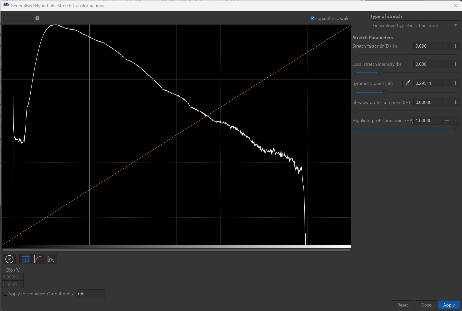
The magic of the logarithmic view of the histogram, is that it can actually for a target shape to guide you in your stretch adjustments.
In my opinion, the best images have this almost straight line shape from the peak (highest point) down to the right and that is the kind of shape we should target with our stretches. Most humps or valleys in this slope are indications of where contrast needs to be re-distributed (added for humps, and removed from valleys). Where the peak lies determines how bright the background is and how broad it is determines how much dim features are apparent (including background noise, unfortunately). In general, the histogram should cover the most of the range of brightness to take advantage of the full range of brightness levels of your display medium. If pixels are overstretched they will bunch up on the right hand side (RHS) of the histogram causing pixel saturation and “star bloat”. In this case, I have purposely kept a gap on the RHS to accommodate stars that intend on adding to this starless image later. On the far left hand side are the dimmest pixels, rising from the darkest pixels with no or little signal (just noise) with increasing signal to the histogram peak.
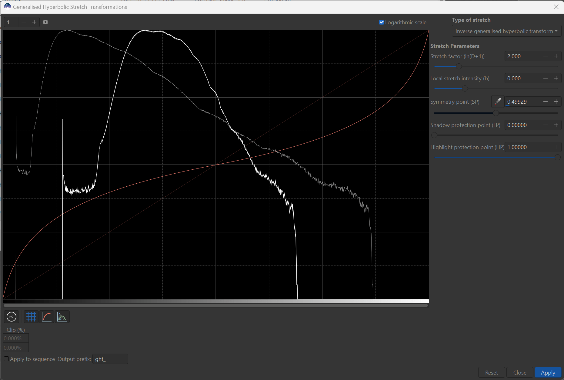
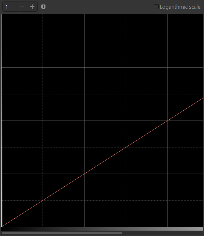
If you notice a red line running diagonally through the histogram from the bottom left to the top right - this is a plot of the actual transform that is determined by the five main GHS input parameters. The diagonal line represent the “no change” or identity transforms. When GHS is started the Stretch factor (ln(D+1)) or just D for short, is set to 0, representing no stretch and this is represents no change to the image or histogram. The importance of this diagonal line as a guide will become apparent in just a moment, but for the sake of this tutorial, please keep your eyes on the image display, the histogram, and the red lines/curves that are the transform simultaneously.
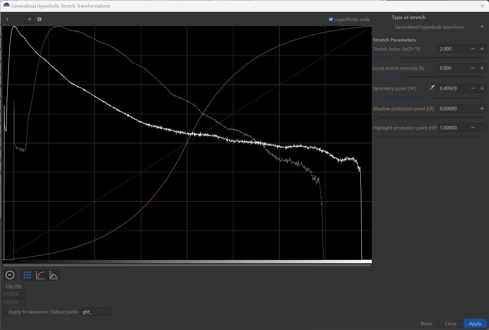
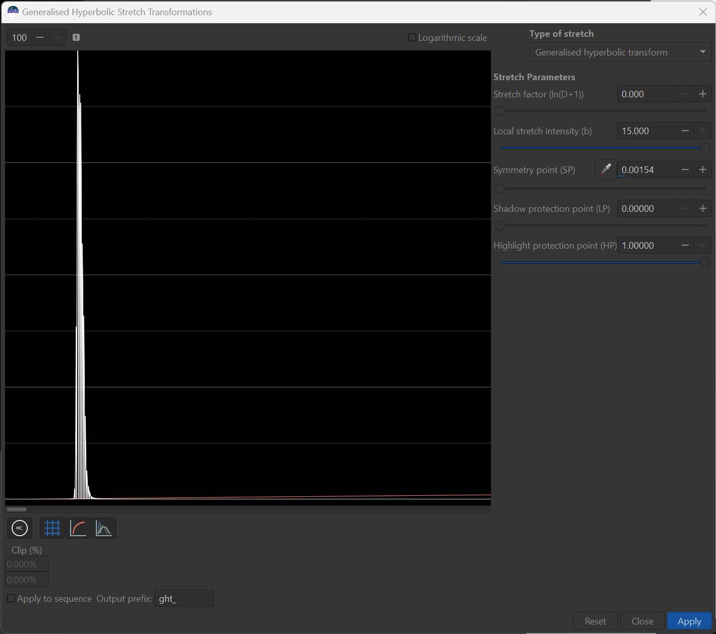
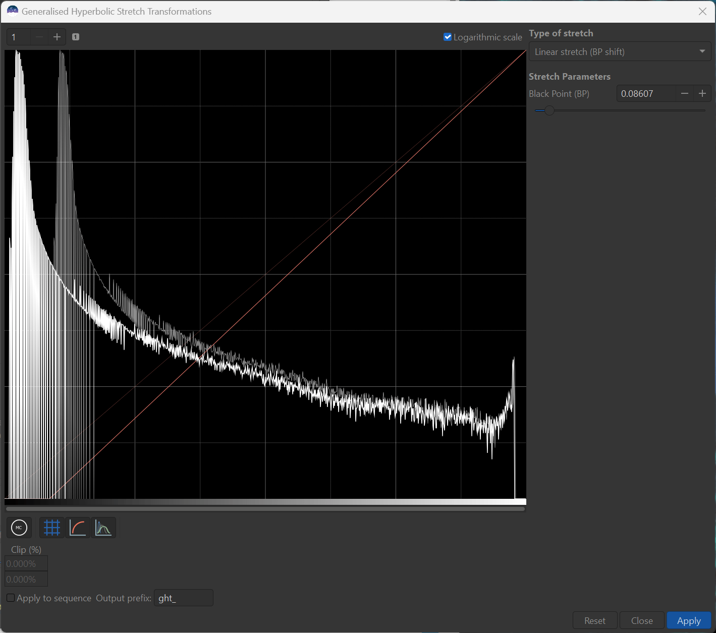
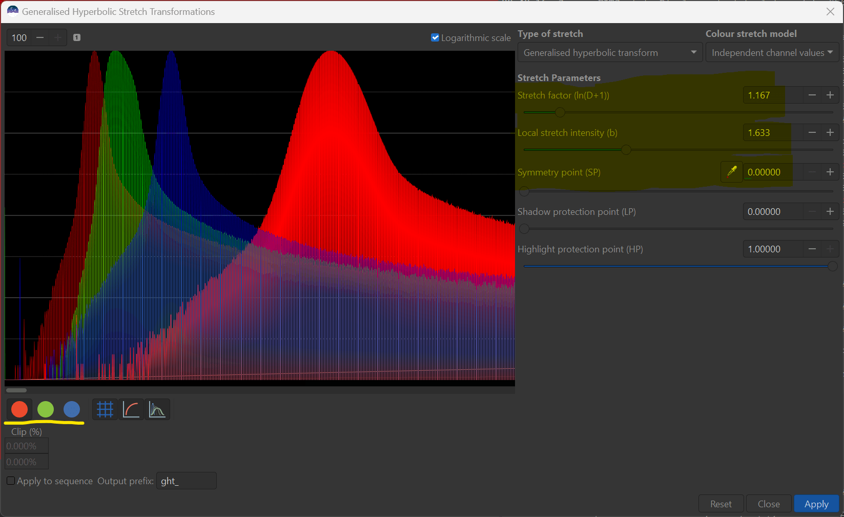
Initially, I would like you to first move the Symmetry point (SP) slider to about 0.5 (no need to be precise). This can also be done by clicking on the histogram plot about half-way across. Then, I would like you to gradually move the top, D slider over to about 2. All of a sudden you will see a lot going on! - with the red transform curve, the histogram, and the image itself. I encourage you to move D back and forth and play with it to you get a feel for what it is doing to all three.
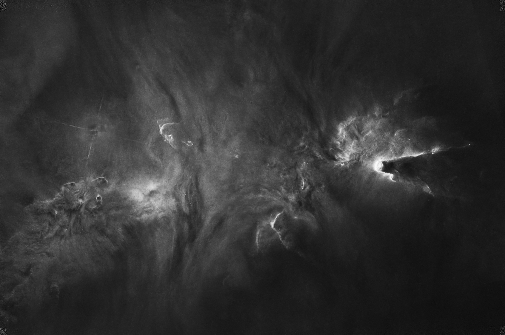
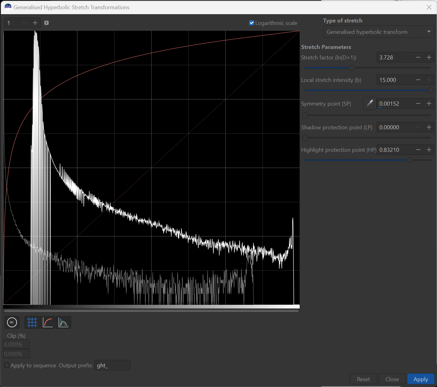
Here is my histogram and image with a D of 2 and SP=0.5 applied:
After playing with D a little bit we can get a sense for what the transform is doing.
The image shows we have injected a lot of contrast into the mid-tones while brightening the brights and darkening the darks - and we have clearly over-done it in the image. You can see from the histogram that on the LHS the histogram has been shifted quite far to the left, while on the RHS the histogram has been shifted quite far to the right. There are far fewer pixels now in the middle, representing the mid-tones - so we can being to relate the histogram shape to the effect on the image. In effect the (log view) histogram has become a broad-based valley which , which is not generally aesthecally appealing as it represents too harsh a contrast add.
It is helpful to see what the transform (red curve) tells us as well. The key to understanding the transform curve is to relate it to the identity line that I pointed out earlier. Where the transform curve lies above the identity line, pixels are being brightened and the histogram shifted to the right. Where the transform curve lies below the identity line, pixels are being dimmed and the histogram shifted to the left. The steepness, or slope of the transform tells us where we are putting contrast. Again, relating this to the identity line - contrast is being added in the mid-tones where the transform is steeper than the identity line, and taken away. On the LHS and RHS the transform line is shallower or flatter than the identity line and contrast is actually being removed from these areas. The overall curve itself represents an S shape, that you may be used to doing to add contrast to the midtones of your image.
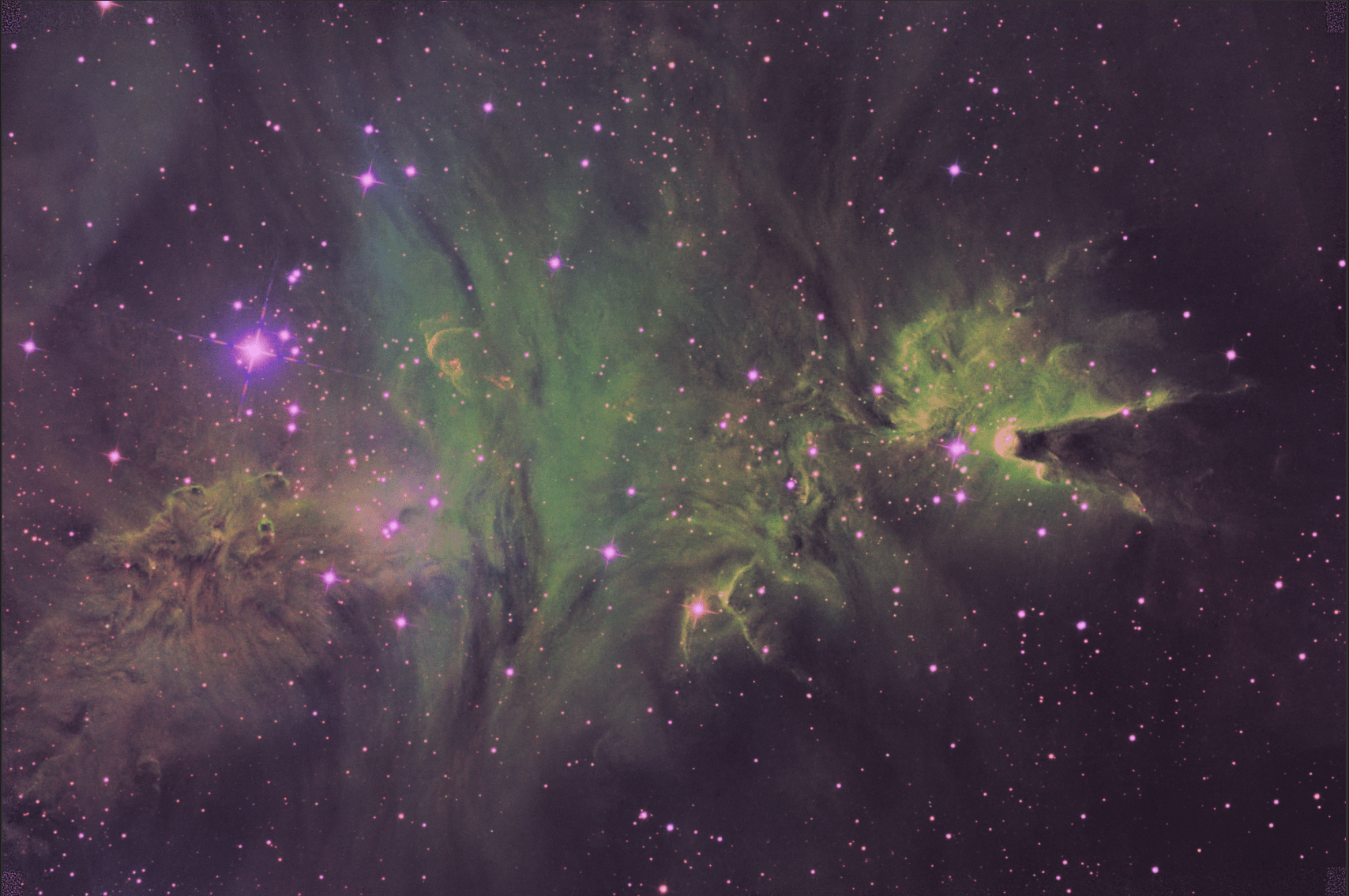
Once you settle on a D of about 2 (leaving SP around 0.5), you may find it helpful to change the Type of Stretch to Inverse generalised hyperbolic transform and pause to examine the results. Here are mine:
You can see that we have done the opposite with the inverted transform (now an inverted S shape) by adding contrast on the far RHS and LHS, brightening the dims, dimming the brights and squeezing the histogram to the middle. The histogram is create a bit of a bulge to the right of the peak, and this has left the image itself fairly flat looking and crying out for more contrast in the middle.
Switch back to the Generalized Hyperbolic Stretch and lets take a look at that Symmetry point (SP) slider while leaving the D parameter at 2 for now. The parameter SP actually controls the brightness level at which the maximum contrast will be add. Until now, we have defined that to be the middle of the histogram, or the midtones of the image. Go ahead an slide SP to the left or right as see how the red transform curve changes, and what this does to both the histogram and the image.
In general, where SP lies, the transform will remove humps and start to create valleys by adding contrast, and away from SP the transform will flatten any valleys and potentially create humps by removing contrast. The size of the effect will depend upon the level of D.
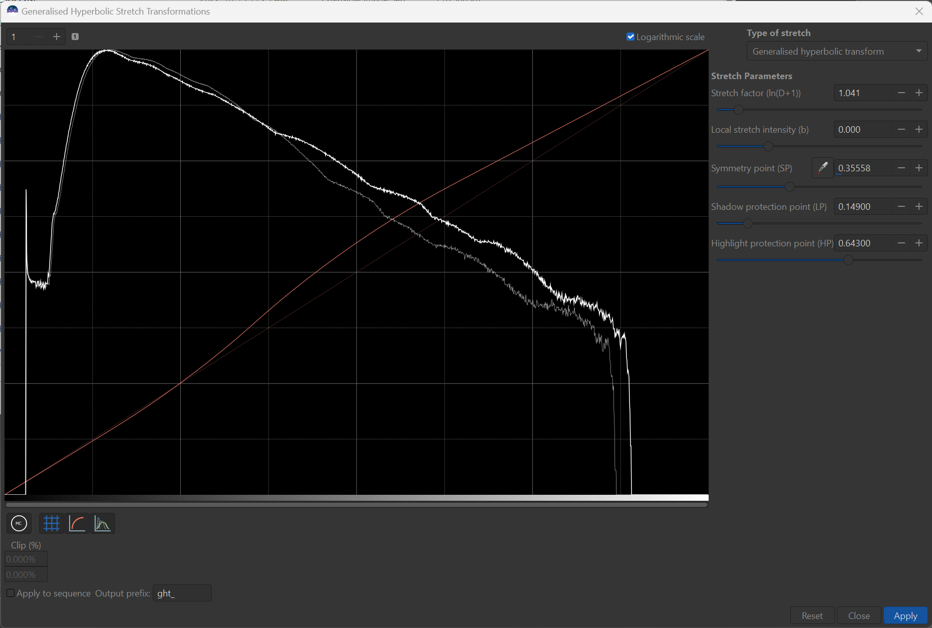
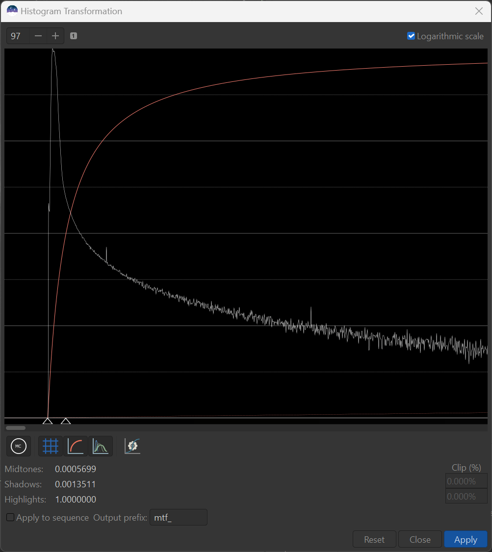
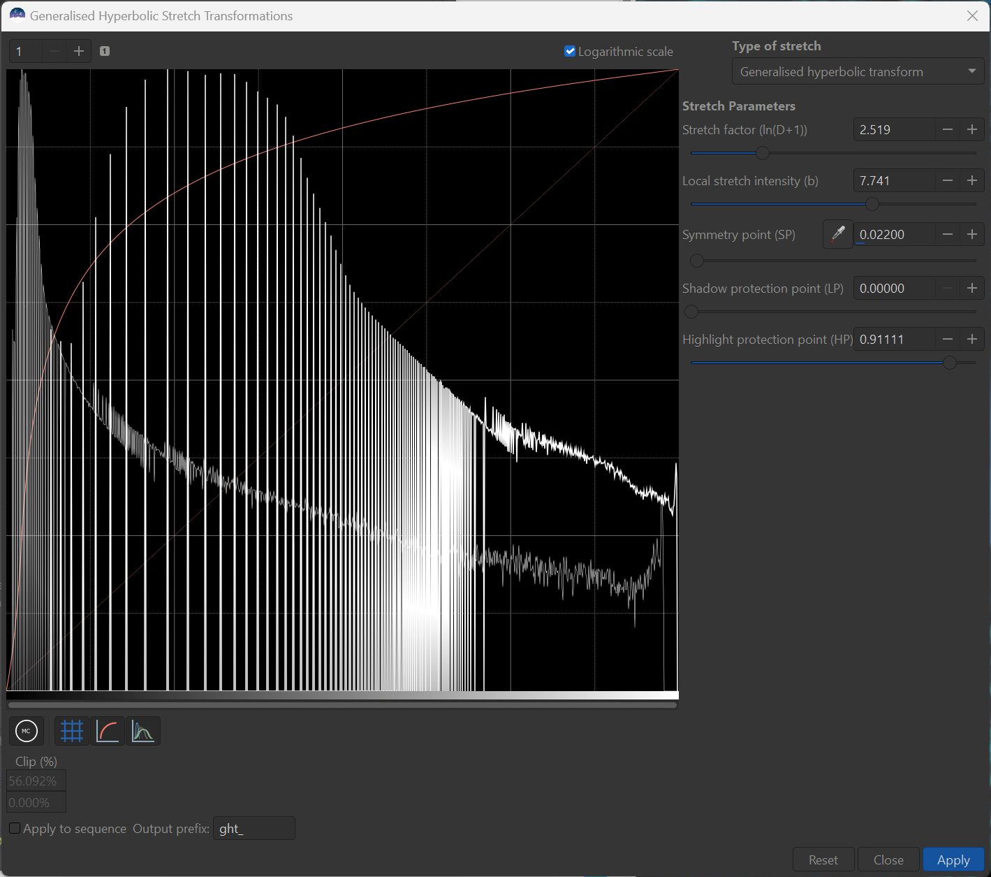
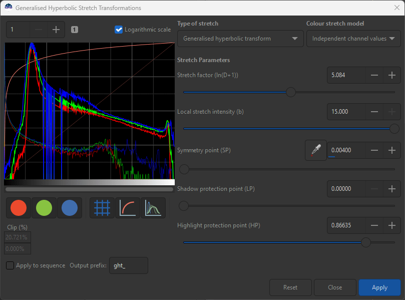
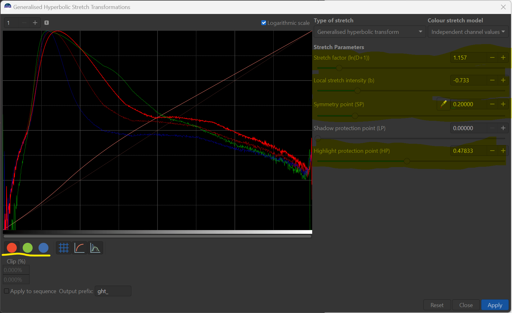
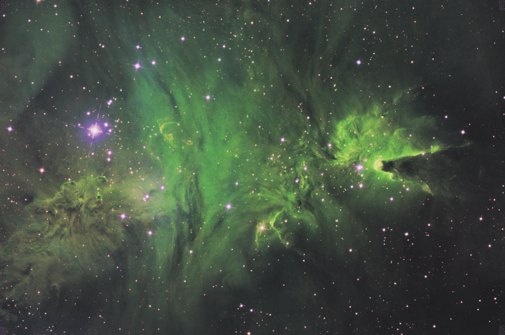
The process of refining my stretch, to me, becomes a process of looking for local humps and valleys in my non-linear image and making the log histogram more of a straight line to the right of my histogram peak. In the case of our current example. I do notice a bit of a broad based hump just to the right of my histogram peak. I can place SP (where the maximum contrast will be added) right on top of the peak and adjust D until my histogram is straighter - as shown here:

And here is my image preview.
Now, I personally like the midtones of this image more than the original, and I agree that there is better contrast in the midtones, but the brights have gotten a little too bright, while on the dark side, I can’t really see the same level of details as the original.
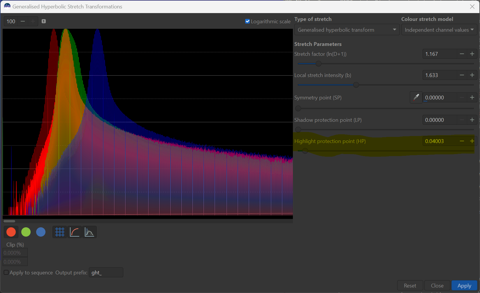
It is at this point, we can explore and make use of the next two parameter in the transform - namely Shadow protection point (LP for lowlights point) and the Highlight protection point (HP). Both of these parameters work essentially the same way, but from opposite sides of the histogram.
To see how this works, reset you image to an SP=0.5 and D=2 and, at first, increase LP from its initial 0 towards SP (note LP must be <= SP). You will see the darks re-brighten towards their initial value. At the same time you can see the transform move back towards the identity line. At the point where the transform lies right on top of the identity line, you have left all the pixels less than LP unchanged! However, you can keep going and brighten the darker pixels even above their initial level if you want to.
HP does the opposite and its initial level sits at 1.0. Move HP lower darken highlights by protecting the contrast at the high end. In practice, I almost always use some level of HP in order to prevent the brighter portions of nebulosity, galactic cores, and stars themselved from “blowing out”. Using the sliders on your image, play with what happens to the transform, and note changes in both the image and histogram. Try adjusting the LP and/or HP to place a portion of the transform right atop the indentity line and observe that this leaves those pixels unchanged.
For our example, I have now employed LP and HP to reduce (protect) the darkening of the dims and brightening of the brights, yet added just enough stretch to make my histogram more of a straight line.
Now there is one last important parameter to discuss, and that is the Local stretch intensity or b.
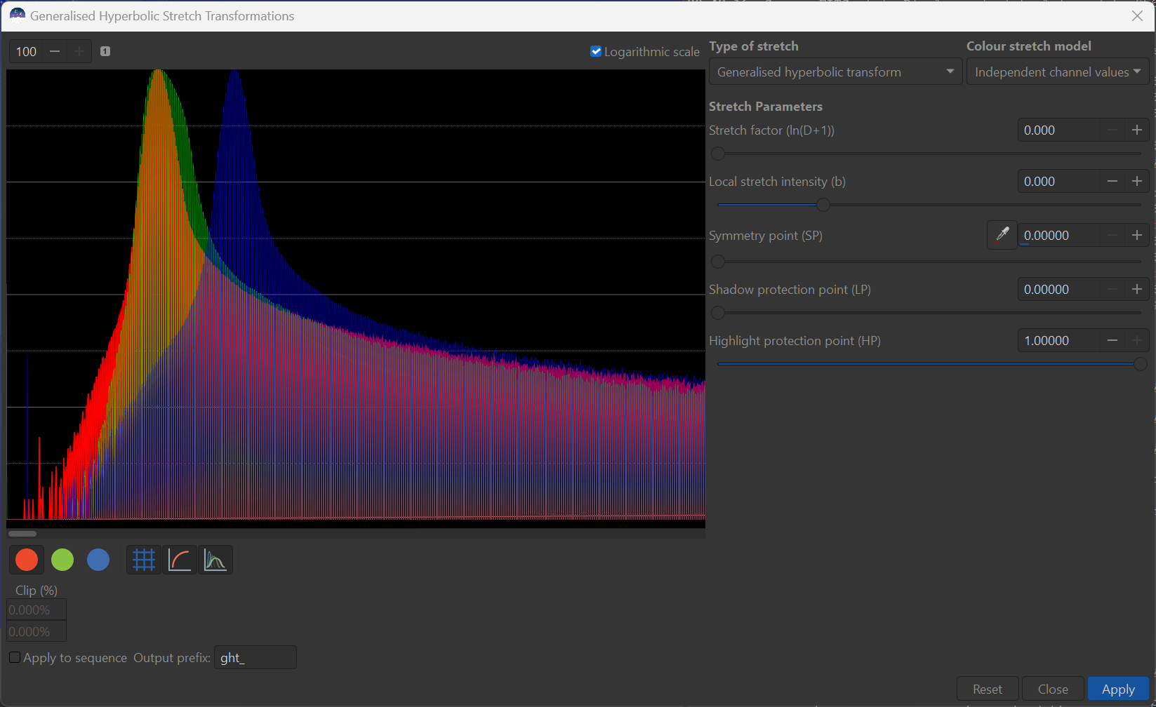
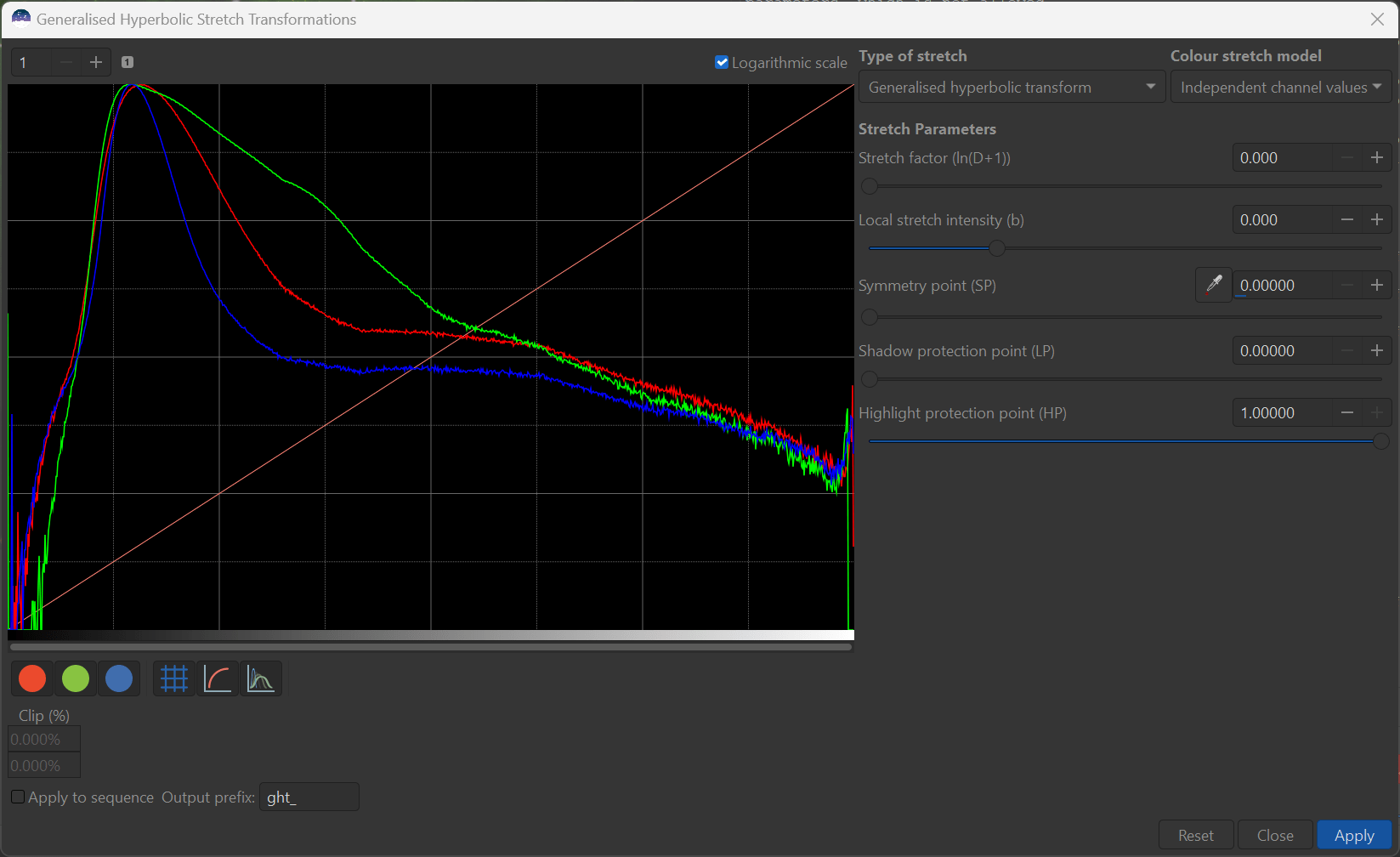
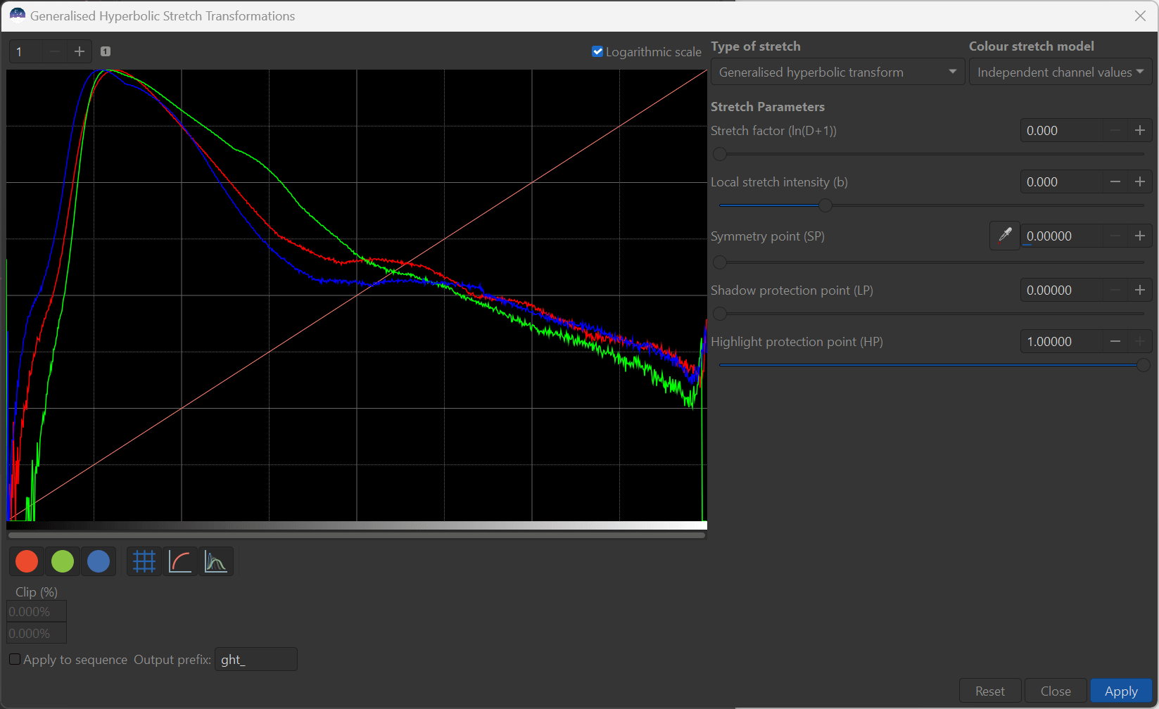
The b parameter essential determines the concentration or focus of contrast addition around SP. To illustrate this, hit the reset button on the lower right of the GHS transform window - this will return all the parameters to 0, except HP, which has its home at 1. Once again set D to about 2, and SP somewhere in the middle of the histogram.
You should see the nature of the GHS transform change as b increased from 0 through 1 and on to a maximum of 15. At b=0, the transform is taking contrast away from the furthest away from SP and putting it in the neighbourhood of SP. As b is increased past b=1, the far reaches are less impacted and the transform contrast is added right at the SP point - at the expense of moderate distances from SP. In essence, the contrast addition is being concentrated or focussed right at SP.
The net gist of using b in finalizing stretches is that b should be geared towards the “width” of the histogram region you wish to change. For example, to get rid of a peak or narrow bump in the histogram, one should use a large b factor to concentrate the stretch and for broad bumps a lower b factor should be used. Typically, I am using a b from 2 to 6 to make adjustments to the initial stretch. In practise you may have to iteratively also adjust D, and even SP somewhat as b is changed to find the spot that achieves the best result. Note that we need to avoid creating a deep valley or “bifurcation” of the histogram which generally does not look good.
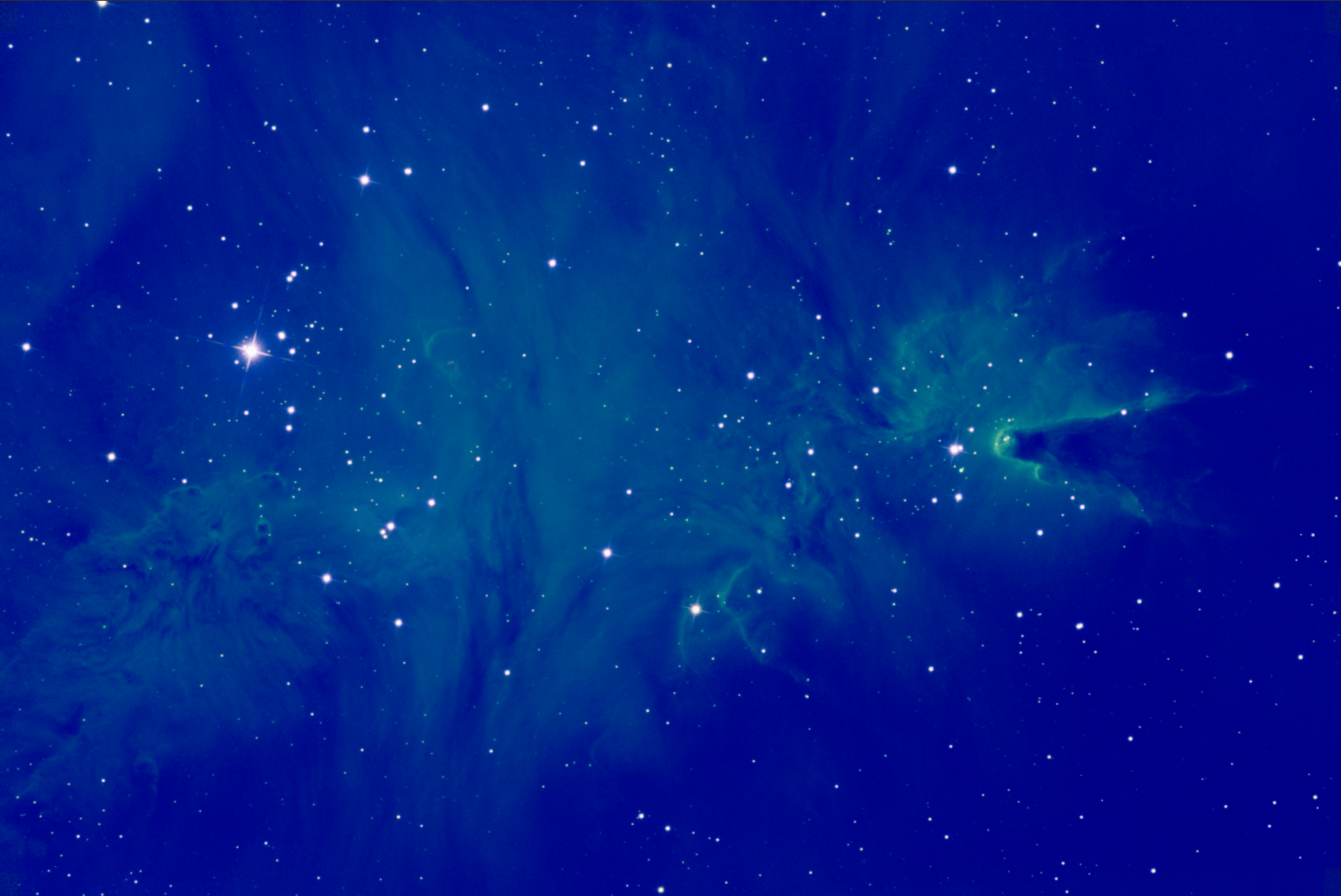
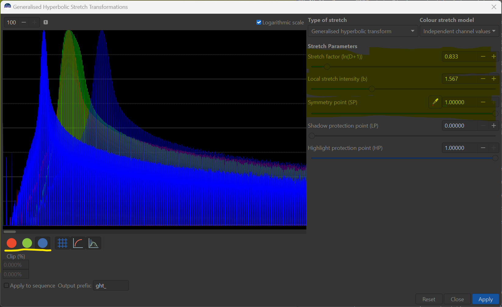
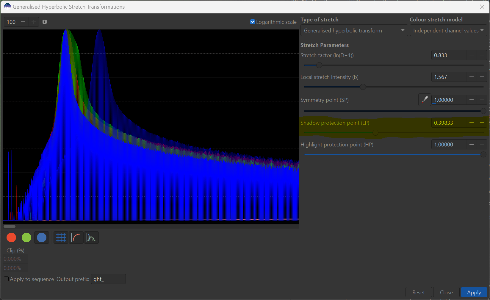
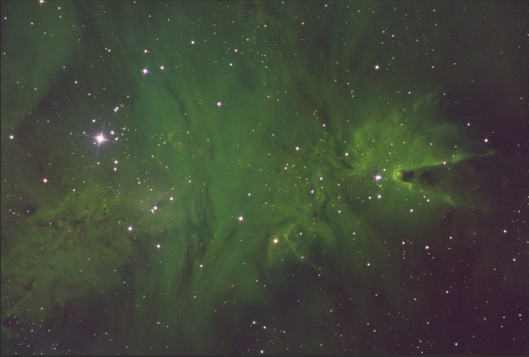
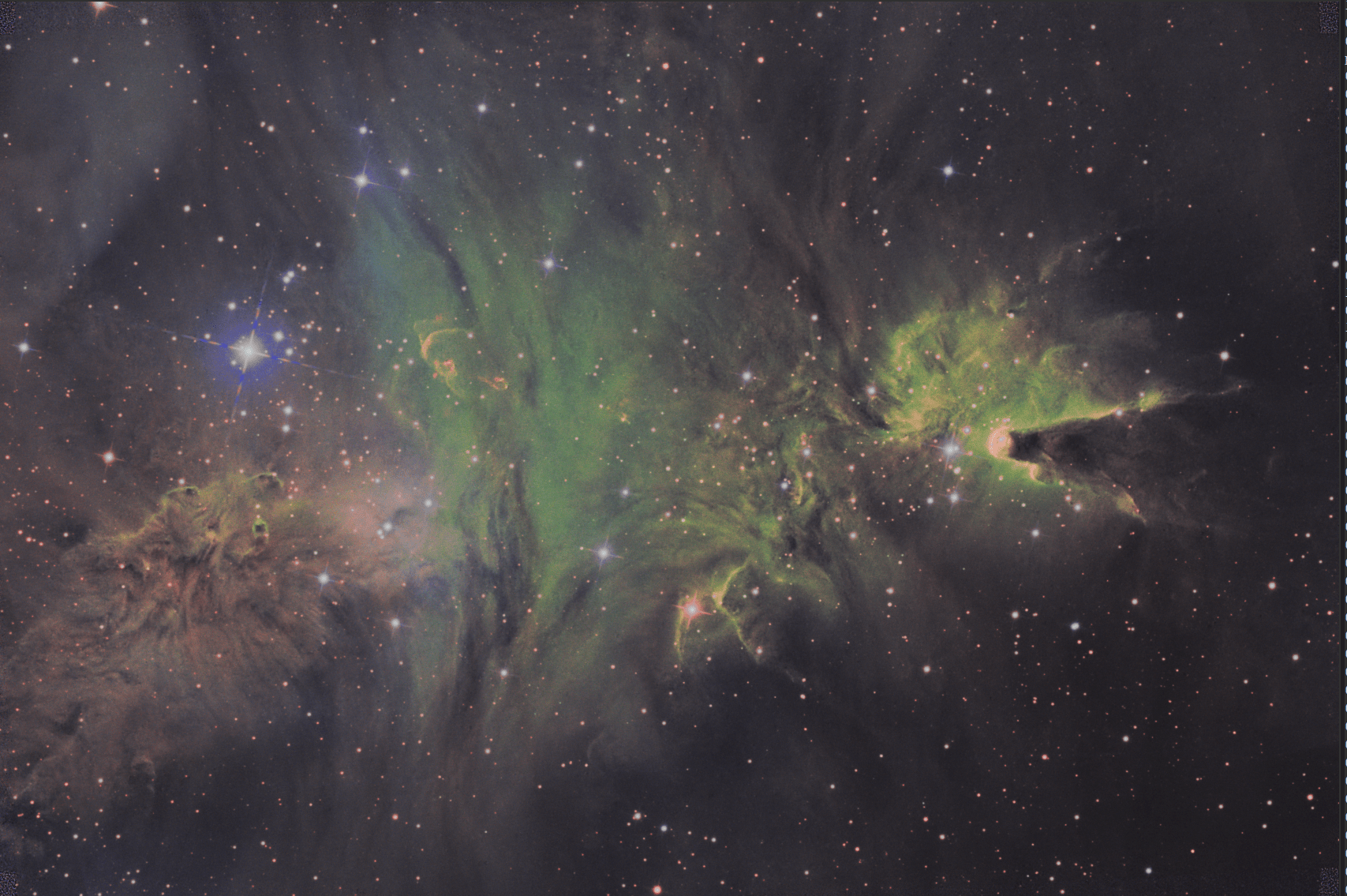
While the use of b can be somewhat unclear to the novice GHS user, it will come as you try it out. Some dramatic changes in the nature of your image can be realized through its implementation. For example, by employing a stretch with a large b and SP set at the histogram peak representing the background of the image, details of faint nebulosity or IFN can be revealed, such as the following stretch on the example I have used.
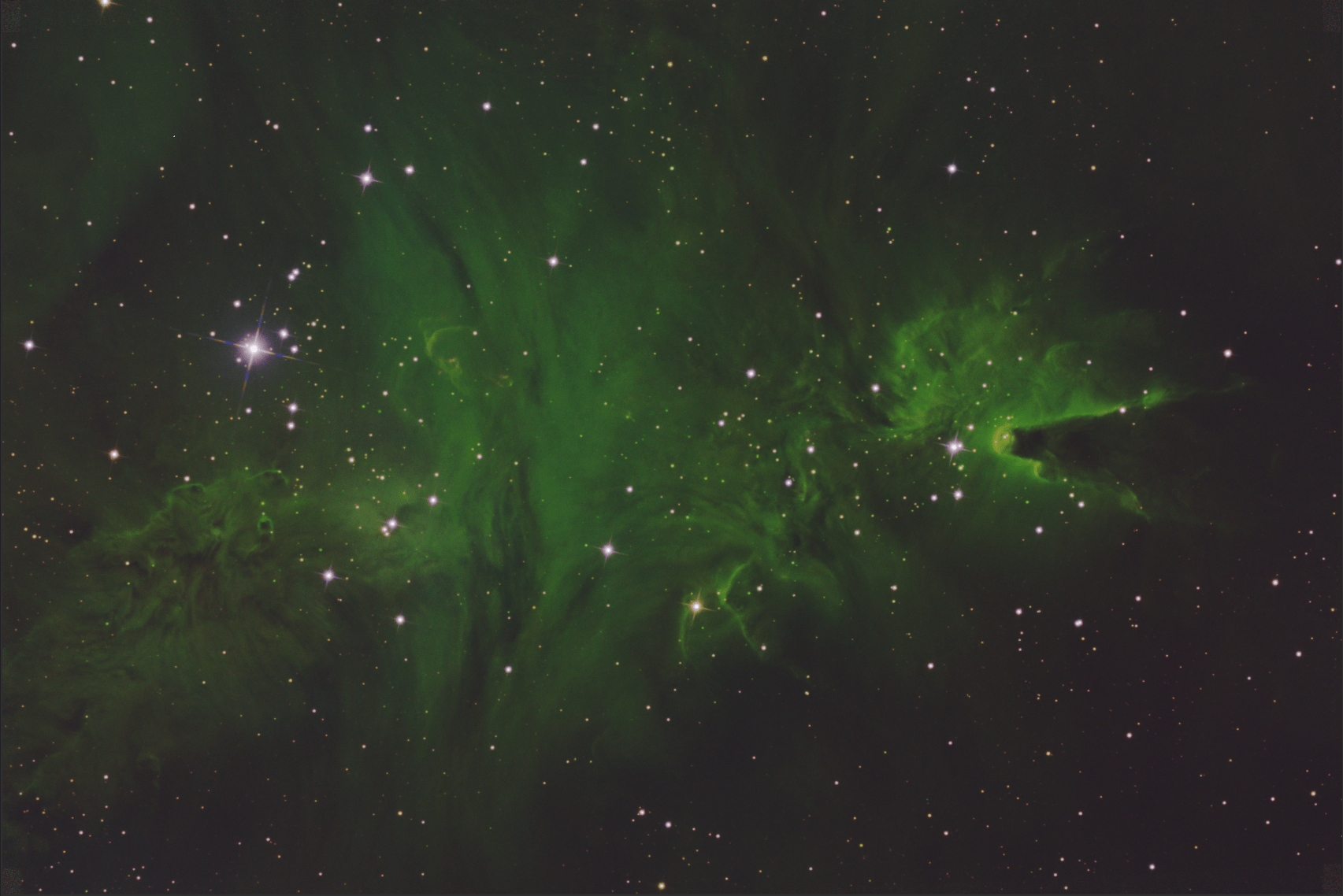
Now is this rendition “better” than the previous one. It certainly is different in nature. In this manner designing the final image, through adjustments of the five GHS parameters can allow you to highlight the scientific observations you want or bring out your artistic side.
You will note that negative values of b are also allowed under the transform. When negative the GHS equations become logarithmic in nature and a b=-1.4 actually duplicates closely the results that are obtained using an asinh stretch. A negative b is best when an overall brightness increase or decrease is wanted without dramatically changing the contrast distribution in the image. In addition, a negative b work well at adjusting colour saturation levels.
The GHS transform equations and its mathematical properties means that stretches can be applied numerous times to make unlimited adjustments to images without adding noise or artifacts to the data, at least within the numerical precision afforded by the image. There is no data clipping. If you don’t like what you did last, then undo it, invert the stretch, or perform even more stretches to repair.
Performing Initial Stretches Using GHS #
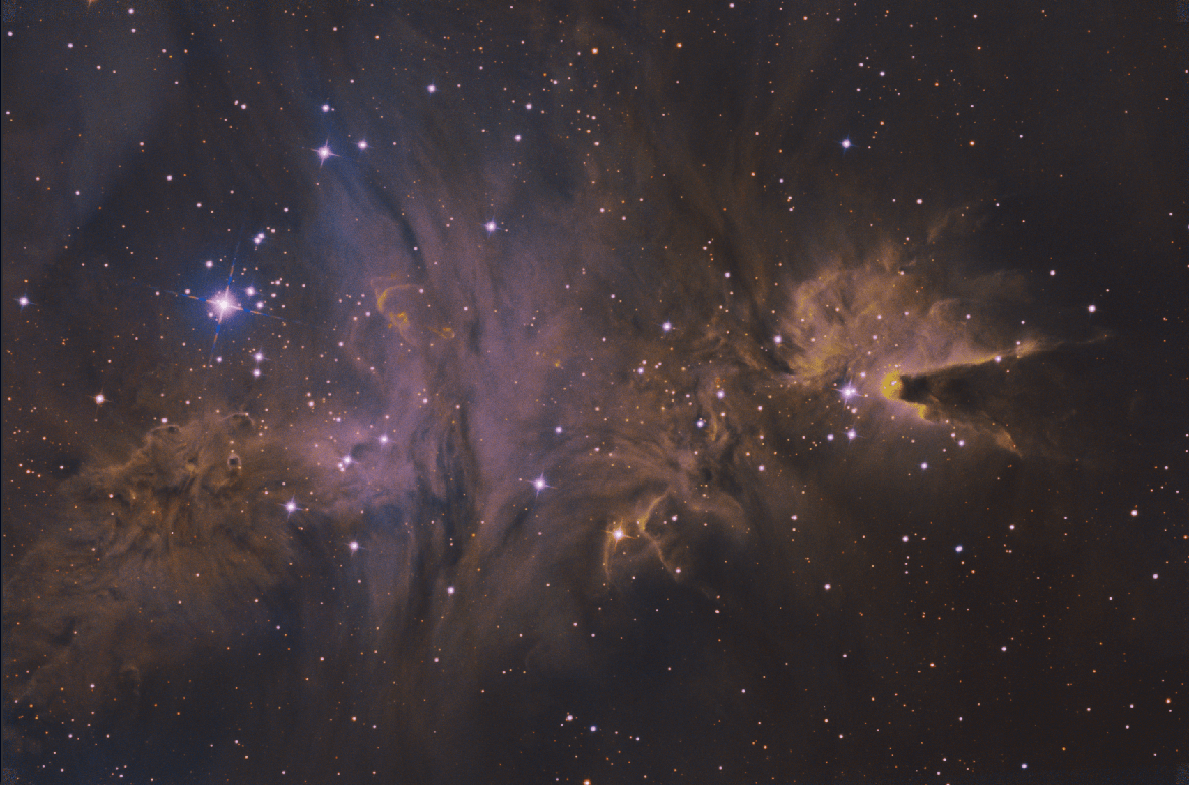
The first challenge in stretching a newly stacked and mainly dark linear image is that you don’t really know what you have until the stretching is done. For example, here is the linear form of the image I will be using to demonstrate the primary stretch.
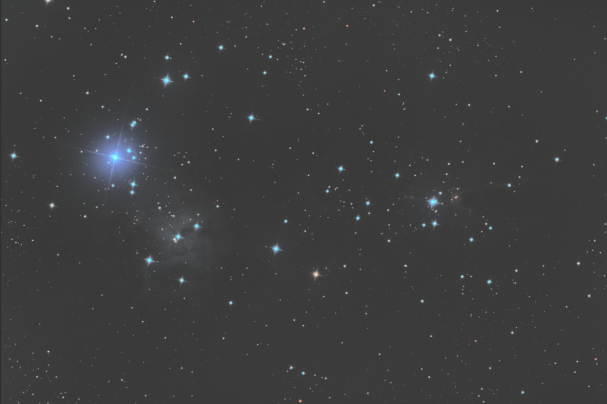
I am sure your won’t recognize it, but it is based on the same data as the previous example, only this data set is prior to star removal - to make the stretch more challenging as often it is either not possible, nor desirable to remove the brightest objects in the image such as stars or galactic cores. The bright dots that you see in the image are the actually cores of the brightest stars in the image.
From the linear view of the histogram, you can see that the overwhelming majority of pixels are far to the left of the entire histogram - which is why the linear image can’t be seen. This is where almost all of the data - all of the nebulosity, background, and also noise - exist. The logarithmic view, however, shows that there are some key pixels, representing the stars throughout the histogram and it is these pixels that you can make out in the linear image.
Somehow we have to brighten and add a lot of contrast (spread out) the histogram peak in the linear view, without cramming all of the star pixels up against the right hand side of the histogram so that they are white blobby messes. This must be done in a non-linear (math speak for “curvy”) way, using a curvy transform to accomplish this.
Likely the very first stretch that you currently do, is a simple (non-linear) histogram transform to better see what you have for data. Here is the zoomed in - non-linear view of the histogram transform auto function that the module proposes for the stretch. The zooming in of the LHS of the histogram is done to better see what is going on near that all important portion of the linear histogram.
The application of the auto histogram transform is actually a two step process:
- The histogram is renormalized via a linear stretch and the parts on the gaps on the left of the data and right of the histogram are clipped to increase the contrast with in the image.
- A non-linear (harmonic) stretch is applied (equivalent of a GHS stretch with
SP=0andb=1) with a stretch amount (GHS D equivalent) set to the value that places the new histogram peak at about a quarter of the way across the new histogram.
Here is the resultant preview and logarithmic, zoomed out view of the histogram.
This is a reasonable job of stretching. There is some loss of star definition and minor star-bloat in the image, as is evidenced by the pixels starting to gather on the RHS. Also, the dimmer portions of nebulosity are mostly lost. I posit that with a little practice and a few more, but similar steps, GHS can accomplish a much better result. So let’s go back to the linear image and I will show the modified recipe for initial stretches.
- Set
SPandb: Open GHS Transforms and zoom in on the LHS on the histogram - linear view, zoomed in up to 100x. First setSP. What you want is forSPto lie within the visible histogram peak itself, yet just to the left of the highest point itself. Recall that this is the point a which GHS will impart the maximum contrast (rather than at 0 as with the HT-auto process). This can be done best by clicking on the histogram plot itself, or by using the eye-dropper button to click on a dark portion of the image itself.SPshould be a very small value, but not 0. Then using the slider, set an initialbvalue to 15. This will make the transform super harmonic and concentrate the most amount of contrast atSP- just where we want it. You wont see any change in the image yet, because the stretch amount,Dis still set at 0.
-
Apply
Dand adjust:Zoom out of the histogram, and check the logarithmic view of histogram. Once can clearly view both the histogram and image preview, keep you eye on both while using the slider to increaseD. Keep increasingDuntil you can just make out the details of the background. and check that one of the following if one of the following is occurring - note that nothing bad is happening to your image/data, just that there are adjustment that will make you image better. One of the beauties of GHS is that just about anything can be repaired or enhanced with further applications.-
The background, possibly with noise, is either getting too bright, along with the subject matter or you are leaving the dimmest nebulosity behind in the background. This will indicate that you may want to readjust
SP- if the former than you will like want to increase SP and if the latter, decrease it. This can be done via manual entry into theSPtext box or fine +/- adjuster, but I find it is best done using clicking on the image itself with the eye-dropper tool. Ideally you want to place SP right where the dimmest features you want to see are located, but above the level of too much noise or features you may want to hide. I recommend, even if you image looks Ok, you may wish to exploreSPa little more. -
You start to bifurcate (create two prominent peaks) as
Dis increased. This is an indication that you are adding too much contrast, possibly at the wrong spot. If this is occurring you should back off bothbandDto a lower level, to just where the bifurcation is occurring. This will dim the image again and may mean you have to do multiple “initial” stretches (which is my norm anyways). The next step is to adjustSP. Bifurcation can occur if the SP value is too high or too low, or even if it just right, but it is best to check. If the stretch cannot be improved by adjustingSP, then leaveDandbat the reduced level. -
The pixel start to form a large secondary peak on the RHS of the histogram (the start of star bloat and definition in the brightest objects). If this is occurring, then
Dshould be backed off. You can also apply anHP < 1, which will help, but I prefer to back offDand address the issue with subsequent stretch. -
Excessive graininess / noise in the dim features. Normally I do a black-point adjustment as my second step in the “initial” stretch, but if the gap between 0 and the left hand side of the image is too large to begin with, then you may wish to do step 2 before this step 1.
-
Everything looks fine. You may be in the fortunate circumstance where you can get away with only one “initial” stretch. Still, you may wish to not take the image to full desired brightness at this stage - are you sure your not missing something? My base recommendation is to at least make the initial stretch process a combination of two big steps, so I would stop where you can actually see most of your subject matter even if it is considerably dimmer than you would like
-
Here is my result after step 1, in terms of both the histogram and the preview image. Obviously, some more stretching needs to be done in this case, it was the stars (under 1C), above) that limited the amount I was will to increase stretch.
- Execute the Stretch
- Set and Apply Linear
BPshift
It is generally after an initial stretch that I like to employ a linear stretch to reset the black-point because I have don’t have to deal with a zoomed in histogram. Simply switch the type of Stretch to Linear stretch and you will see a single input is required - the black point that you desire. With the histogram set to logarithmic I click on the histogram plot to the left of, but as close to the start of the histogram rise as is possible. Don’t worry too much about getting extremely close, but if you do encroach on the data itself, you will be clipping and losing some of your hard won data - but maybe it is just noise or you are after an effect. In practice, I never try and clip the original data. Here is my preview histogram.
Note that this exercise will redim your image somewhat, but don’t worry about that for now. When you are happy, hit apply.
- Apply Second GHS Transform. This is in essence a repeat of steps 1 to 3. However, in this case there is no need to zoom in on the initial histogram, and there is a lot more latitude for parameter adjustment. Once again, keep your eyes out for the same things noted under 2) above using
Dto adjust the amount of stretch- Higher
bto spread out the histogram peak and leave definition in the stars SPgenerally in the histogram peak, but vary to adjust the relative brightness of the subject matter components.LPand HP to further protect the lowlights and highlight (stars, galactic cores, bright columnar edges, etc) and control the overall brightness of the image.
Here is my preview and histogram of my second GHS stretch
When ready, don’t forget to apply the stretch. You may find you have to repeat step 5 once or twice more and that is just fine. Once completed, you can proceed with other non-linear processes, intersperced with follow-up stretch adjustments.
I believe, with GHS, you can ultimate achieve a better contrast distribution that with other methods, while not corrupting the data itself. When dealing with nebulosity, you might find that removal of stars is not necessary. Clearly, this image is still in need of contrast redistribution using follow-up GHS stretches, but it is a great starting point for non-linear processing.
Dealing with Colour #
The standard stretch of a colour image proceeds the same way as a monochrome stretch, only there are initially three histogram represented in the histogram plot - blue, green, and red - one for each channel. This can be daunting at first, but if you are familiar with monochrome stretching all you are doing is stretching “three monochrome images” at the same time - only now we may not only be concerned with contrast and brightness, but also the relationship between the the three colour channel histograms themselves. Fortunately, we can generally proceed with a very simple approach to this relationship and we will build upon that, once you understand how this relationship can be manipulated. You will see, in the end, that what colour stretching provides is another degree of freedom with which to show the science and express your artistic creativity at the same time.
Basic and Enhanced Colour Stretches #
To illustrate basic colour stretching, we will employ an RGB colour image of the same subject matter as our monochrome images above, only this time representing three channels taken through red, green and blue filters that are placed into channels and colour calibrated. Alternatively, such an image could have originated by a “one shot colour” camera which uses filters for all three colours at once that ultimately achieves achieve the same thing.
After colour combination, this image has been colour calibrated (using photometric colour calibration, in this case) while in linear form to achieve both a neutral colour in the background, and achieve a nearly average white colour for the stars. In the photometric colour calibration, the colours of the stars are actually benchmarked and adjusted to match known star colours obtained through photometric analysis.
In this initial histogram view of our calibrated RGB colour image - shown in GHS and zoomed in on the far LHS of the histogram because this image is still linear. It is important to note, that in this calibrated image the histograms are all overlapping and the histogram peak are all roughly at the same point - this is the result of the photometric calibration. The major difference between the colour channels seems to be their width.
I note that in this case, there is initially a large gap (compared to the histogram itself) on the LHS of the histogram. To compensate we will switch the histogram view to logarithmic and set a black point to reduce this gap, yet only clip a very few pixels.
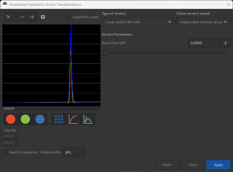
You will likely see that now we have three preview colour channel histogram plots to go with the three of the original colour image.
Once resetting the black point is accomplished, we can proceed with same procedure to use GHS to stretch a linear image as was illustrated in the monochrome example. In general we will want SP placed within the histogram of all three colours, but to the left of all the peaks - but again you can always see what your image looks like if you don’t.
Here is the zoomed out version of the histogram preview using a large b (for an initial stretch) and enough D to be able to see the most of the image.
The resulting image after the first stretch will still need some stretch adjustments to better show nebulosity, but it does show definition in the stars. However, before we proceed to correct this, lets pause to address the colours that are coming out of the image.
The parts of the image that have been brightened the most, the stars themselves, seem to have been bleached somewhat of their colour. This is a common occurrence when the same stretching transform to histograms of different colours that are very close to one another, as was done here.
Fortunately, there are couple of alternatives to this methodology. The first alternative is to use the methodology you may have already seen employed by the “arcsinh stretching” module. This method consists of stretch the luminance of the image and then applying the resulting stretch amount of the luminance to each of the colour channels. The effect of this new method is to stretch the colour saturation along with luminance and can be invoked by selecting Color Stretch Model -> Even weighted Luminance from the GHS transform controls. You can see how this has adjusted the histogram and provided more colour in the stars:
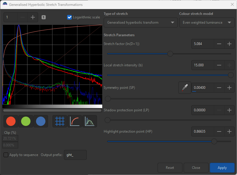
This restores colour saturation to the stars or other bright areas of the image. A slightly different result can be obtained by selecting Color Stretch Model -> Human weighted Luminance.
If the result from either selection is too much, then consider subdividing your stretch into two smaller ones - one employing the weighted luminance and one employing independent channel stretches. If not enough, then leave the color stretch model selected to one of the weighted luminances for follow-up stretching.

You may be asking “where did all the nebulosity go?” You will note that this target is mainly emission nebula, which does not show readily in broadband, red-green-blue imagining. What you do see is reflection nebula together with a hue accurate representation of the stars.
If you don’t particularly like the luminance weighted options as shown here, colour saturation can be stretched separately within the “Color saturation” module within Siril. Either or a combination of any the methods can be used to achieve your desired result.
Follow up stretches will have to consider colour saturations and hues in addition to contrast distribution and brightness. This can be a lot for even a seasoned image processor to look after. In addition some linear and non-linear processes can easily create colour artifacts. For these reasons, it is common practice to extract the luminance from RGB broadband or narrowband images prior to stretching but after colour calibration or shoot luminance with its own filter altogether. This allows one to deal with luminance separately from colour images. The goal is to get the contrast and brightness correct in the luminance image, and concentrate of saturation and hue with the colour image. Generally, in the non-linear stage when most of the processing is completed, the luminance and colour images can be brought back together using the “RGB Compositing” process.
Manual Color Calibration #
Narrowband colour images also generally require colour calibration as well as broadband RGB, although photometric calibration is far less often employed. Since we are dealing with “false” colours anyways, we tend to use colour either to help reveal information contained in the data or more for aesthetic purposes. Often when using Ha, [OIII] or O, and [SII] or S filters, we resort to the popular “Hubble palette” which is a rather loosely defined colour palette where S is assigned to red, Ha is assigned to green, and O is assigned to blue pixel colours, which manipulation of the Hue to remove some or all of the green colour, although the principles of colour calibration and stretching demonstrated here will essentially be the same.
Regardless, in general the expectation of either narrowband or broadband is that background colour will be neutral and while one colour may have dominance, all three colours will exert themselves to balance the image. To achieve this condition, the histograms for red, green and blue pixels should largely overlap. Unfortunately, this is rarely the case when narrowband data is first combined into a linear RGB image, as can be seen in the auto-stretched view of linear image (with colours linked). In this case, blue is dominating the image, with green exerting itself, just in the highlights, while red appears almost absent.
I will pause here to say, this issue can be partly corrected by performing “background extraction”, but in some cases nebulosity appears almost everywhere and I would like to be careful not to remove signal that I only think is background. I can also get a better glimpse of what the colours should looks like, by delinking the colours in the auto-stretch, but this only fixes the view and not the image itself - besides I want to keep the image linear for now. I highly recommend, when manipulating colour in linear mode, that you initial leave auto-stretch on colour linked mode, as this will give the best indication of what we are actually doing to the colours.
The colour observations on the auto-strech view are also reflected in the image histogram (linear view, zoomed in to the LHS).
I think you can see that the blue histogram is to the RHS, and barely overlapping the green and red - this is why the image is so blue dominated. The green is the widest histogram , however, suggesting that it contains the most signal of the three colours.
To achieve colour balance in the background/dimmer areas of the image, we would like for all of the histograms to overlap - particularly in the region left of the histogram peak (representing the background and dimmer areas). The first step is to pick one of the histograms (it is not all that important, but I will pick the middle one - green here - to show how we can move the blue histogram left and red one right, but you can choose to do it any way you like). Fortunately, the transform within Siril can be performed on a single colour at a time, and we will make use of this to achieve our colour balance.
First we will deal with moving red to the right. To do this, I generally pick an SP level to the left of the red histogram by clicking on the histogram itself - or alternatively you can leave it at 0 (easiest at first). Deselect blue and green by clicking on the coloured circle - the background of the circle will dim when the colour is deselected. With a modest b (set around 1 to 2), I start to increase D. You will see the red histogram move to the right. (if you see more than red “move”, you likely still have the other colours selected). You actually want to over-stretch red at this stage - well past your target location that overlaps green, as can be seen in the histogram preview below:
As you can image, this makes the auto-stretched (colour linked) image very red. I have purposely overshot the target here, as fine adjustment are best performed another way. To shift the red back towards my green overlap target, you should use the HP slider - if you recall, lowering the HP value linearizes the stretch to pixels to the right of HP and dims the overall image. We will take advantage of this image dimming to push red back to the left - first my using the slider, but as red histogram approaches the green overlap, I start to use the +/- buttons to make final adjustments to HP. I may even resort to typing in numbers if I want to get very precise.
Take note of the extremely very low HP value (but still greater than SP) that I used to overlap the green histogram with the red.
When you have aligned the red with the green, don’t forget to Apply your first colour calibrating stretch. Just to make it clear, we have in effect, moved the red histogram to the right to overlap the green histogram, which we had rather arbitrarity picked as our benchmark. You can see that I have focused the placement of the red histogram so that it matches green to the left of the histogram peak.
Now we turn our attention to blue, which still lies to the right of red and green. Select the blue colour circle (with green and red deselected) and this time, set SP to 1. At this setting of SP, the image will be pixels will dimmed when D is applied. Again, set b to around 1 to 2 and slowly increase D and you should see the blue histogram move to the left.
Next, increase D to shift the blue histogram to the left, once again I deliberately overshoot my target, but this time to the left of green histogram. To do this fine tuning, I actually turn to the LP slide to get my precise overlay. As LP is increased, it will re-brighten blue and I stop when it is hits my target.
If you left the image view on autostretch with colours linked, you will see if you have achieved a better colour balance.
I our case, we can see that we have achieved a neutral colour in the dims and backgrounds. The image is still green dominated - but most often this happens when using the SHO colour palette wit Ha providing the greatest signal. However, we seen the green hue vary across the image - influenced primarily by reds. (Note, if you are using a dual or tri - narrowband pass filter with a one-shot colour camera, you will likely see red dominate in a molecular cloud / nebulosity target since the hydrogen alpha spectral line is recorded in the red channel, rather than assigned to green).
At this stage, a very important by-product can be extracted when you have balanced the colours in this way - and that is the luminance channel for the image. Using the “Extraction” module in Siril, and choosing the CIE Lab option, you can extract the L channel to use in additional processing - to be recombined with the RGB image later. Some choose to use the Ha channel as a luminance, but I prefer this method as it also contains information from the other narrowband filters. As a matter of fact, the monochrome images shown earlier were based on a luminance extracted from this process.
At this stage, you may also wish to extract the stars from the image, since this will make the stretching of stars and nebulosity independent of one another. This can provide additional flexibility in bringing out nebulosity without over-brightening the stars - as we did with the monochrome image above. However, the GHT is particularly good at retaining star shape - keeping them small, so for this tutorial, I have decided to leave them in.
Once you have achieved your colour balance, you can proceed to stretch your image to non-linear. (Technically, we have already made the image minutely non-linear - but unless it is scientifically/quantitatively important to you, I won’t tell anyone - other linear processes will still work just fine).
Stretching to non-linear should be done (at least initially) with all the colours selected and employing the same manner as we did for the monochrome image. When the colours get a little confusing, I focus on the dominant colour, and perform the stretches as if “green”, in this case, was the monochrome or dominant colour.
Here is the result after stretching with all three colours selected - more could be done, but you can see the red and blues exert themselves in some highlights and in the shading of the dominant green colour. However, while the green representation is fine in the image, blue and red could be boosted further.
One can see in the histogram of this now non-linear image that red (S) and blue (O) are lagging in the nebulosity portion of the image - in the midtones. To achieve this, we want to finalize our stretching by focussing on red and blue, while leaving green alone - adjusting colour in the non-linear image.
Non-Linear Colour Adjustment #
There are many ways of adjusting colour in Siril - you can directly adjust the hue, stretch saturation, etc., but I have found that there is a role for the generalized histogram transforms is achieving this. The ability to stretch colours independently is a good way to do this. The trick is to exaggerate weaker colours (or diminish dominant ones) to bring more colour variety into the image.
As an example, I first switched off green, and stretched red only in order to bring more red into the stars and show more red in the nebulosity. By playing with the parameters you will get a sense of how to alter an individual colour histogram, much in the same way as we manipulated the monochrome images earlier. Here I have used a low b (negative b) because I want a broad brightening of the red histogram, focussing on the mid-tones - using an SP of 0.2 in this case. In addition, HP has been used strongly to protect the stars from both bloating and from becoming too red.
Next step, I have used a large b to focus the contrast adds in the midtones for red and blue and placed SP to where I wanted the midtones to come from - clicking on the image is a good way to do this. Finally some LP was used to protect the dims and maintain colour balance, along with a low value of HP to protect the brights. All while watching both the histogram and the preview image itself. Occasionally, you can create unnecessary humps in the histogram of the colour you are adjusting, or take the colour out “colour balance”. You can always repair such occurrences with a follow up stretch.
Note that because of the mathematical properties of the generalized hyperbolic transforms, they will not add noise and will not create non-repairable artifacts with multiple applications - at least not down to the numerical precision of the computer. However, if you get lost, it often pays to return to previously saved spot, or even return to the beginning of your stretch - starting on a fresh path forward. With practice, you will soon get a feel for the parameters and how they control both the histograms and the image.
One I got red to a place where I felt it was contributing to the image more, I turned to adjust blue to perform a second set of stretches. Most stretches bring all five input parameters/sliders to bear to control the image adjustments.
A second set of stretches was then performed with just the blue on. , as illustrated in the transform and histogram below to further exaggerate the blue. You can see that, once again all five input parameters/sliders have been brought to bear to control the colour adjustments.
Here is the histogram I finished with. I have brought the blue and red histogram closer, although not completely into line with green.
This is reflected in the resultant image which now shows a considerable hue variation across the nebulosity and within the stars.
All these colour adjustments are a matter of taste, and the ultimate use of your image. You can continue to make selective colour stretches in any combination until you get the effects that you desire. Two points of caution, however. The first comes from the realization that it is likely that you are stretching (brightening) the weaker signals more than the stronger signal. This can mean that the noise associated with the weaker channels can be exaggerated. It is the noise in the data that will ultimately limit how much you can stretch the colour, or the image as a whole.
A second word of caution involves narrowband images and specifically the Hubble palette. As you can see, we did not remove the green dominance that persists in the image. In most cases, you might wish to get rid of the great more, or even altogether. In addition, a magenta tone (caused by a lack of green) has entered into the stars, which is generally not desired. The good news is that there are excellent ways to deal with these SHO issues within Siril.
The easiest (although not necessarily the best) way to deal with the greens in your Hubble image is with the Extraction and RGB Compositing processes as outlined in the following steps:
-
If you processed a separate luminance (L) channel, note its location. If not, extract a luminance channel using the
Extraction -> Split Channelswith theCIE - L*a*boption - you are interested in the L channel. -
Perform or repeat
Extraction -> Split Channelsusing the RGB option. This will create monochrome representations of your colour channels. -
Use the
Image Compositingto put the luminance, red, green, and blue channels back together. Green can be removed from the image by selecting theFinalize colour balancebutton and reducing the contribution of green. Since we have used a luminance channel, the luminance (brightness) will be preserved.
Here are version of the composited image with 100%, 85% and 70% left in.
By trial and error, you can leave green in or out, according to taste. This process is best performed starless, because we are also changing the star colour along with the nebulosity. In addition, you will likely find magenta creeping into the image (particularly in stars).
Magenta can be removed from an image by first inverting the image using the Negative Transformation which will cause Magenta to appear green. By applying the Remove Green Noise, (I like the Maximum Neutral option with Preserve Brightness selected) , on the inverted image, and then reinverting using the Negative Transformation process once again, you will have removed some or all of the magenta from the image and get a “Hubble palette image” with hues that you are more familiar with.
Here is the 65% green version after magenta removal:
You may actually decide that you don’t want green in the image at all, over and above what is needed for colour balance. This can be done also through a combination of techniques above using Colour Compositing and Remove Green Noise applications, but now we are venturing too far outside the scope of this tutorial.
Once you have adjusted the colour of image, it almost always worthwhile to adjust the image, again with GHS, while using all of the colours selected to fine tune the contrast and brightness.
Additional Suggestions #
Aside from stretching, there are many additional processes within Siril that can improve your results much further than GHS alone. In this tutorial, I did not apply gradient removal, noise reduction, deconvolution, wavelet processes, sharpening, additional hue adjustment, or other image processes techniques in the ever expanding stable of Siril native and add-on processes and scripts. Certainly, the images I have shown here can be improved with some additional attention and processing.
One technique that is often used is to separately process the luminance channel (gained from either extraction from RGB or actual monochrome luminance filter frames) and recombine near the end of the workflow. With GHS stretches, in addition to other processes, one can then focus your work on providing contrast, brightness, and details on the luminance image. Stretching the RGB should focus on hue and colour saturation. Finally, when recombined, you will have the best of both worlds.
Another technique many employ is to separate (or extract) the stars before stretching. While GHS is very adept at being protective of stars while bringing out faint nebulosity and details - it is much easier to focus on dim features while stretching the starless image and not worrying about stars, while focusing your star stretch to give them the contrast, brightness, and size you desire. This creation of a starless and starry images also serves to help other processing in addition to GHS, by avoiding many of the star artifacts that come with many processes.
When stretching dim features such as IFN, dim nebulosity or galactic “atmospheres”, you will often find yourself competing with background noise and it may be tempting to over-do noise reduction. My experience is that while GHS can display very dim features, removing them from the background noise may require additional integration time (more frames or longer exposures) to improve signal to noise.
On the positive side, it is easy to miss such dim features that you may not even be aware exist in your data. I highly recommend doing some “exploratory” stretches early in your integrated frames using GHS - focussing not on making the image look good, but on seeing what lies at and to the left the linear histogram peaks. Once you know what there, you can make the decision whether to bring it out, leave it in the background, or whatever you feel makes your image best.
I hope this tutorial helps you and you find joy in your image processing.
Clear Skies, Dave Payne
Many thanks and credit to the work of Mike Cranfield, Adrian Knagg-Baugh, Cyril Richard, and the rest of the Siril team for bringing GHS to Siril.